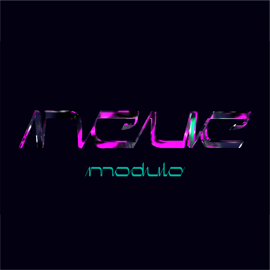
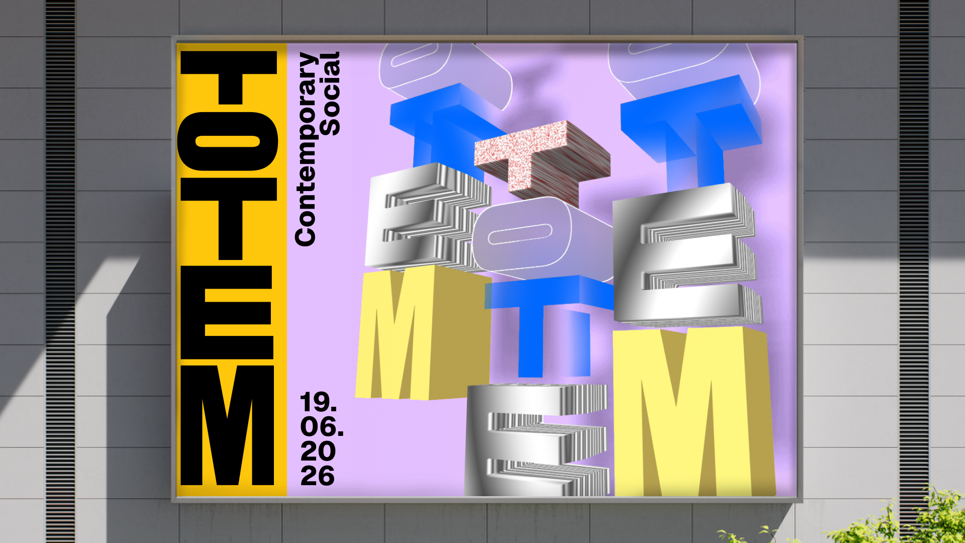
Toplarna Tezno Maribor melts into Totem—a new cultural center rising from industrial heritage. The visual identity is vertical, modular, a pole where artists place their work. A place where community gathers, where culture stacks and grows.
Like a totem pole, the identity is built from stacked elements—each layer an artist, an event, a story. The system adapts, expands, receives. Totem is not just a logo; it is a framework for collective expression.
The identity is vertical, structured to hold the work of many. Artists place their creations within it, layering their visions onto the Totem. A symbol of connection, of gathering, of culture built together.
Toplarna Tezno Maribor was once an industrial center—a place of heat, of transformation, of material passing through fire. Now it is becoming something else: a cultural center, a gathering place, a space where art and community meet. The transition demands a new identity, one that honors the past while pointing toward the future. The answer is Totem.
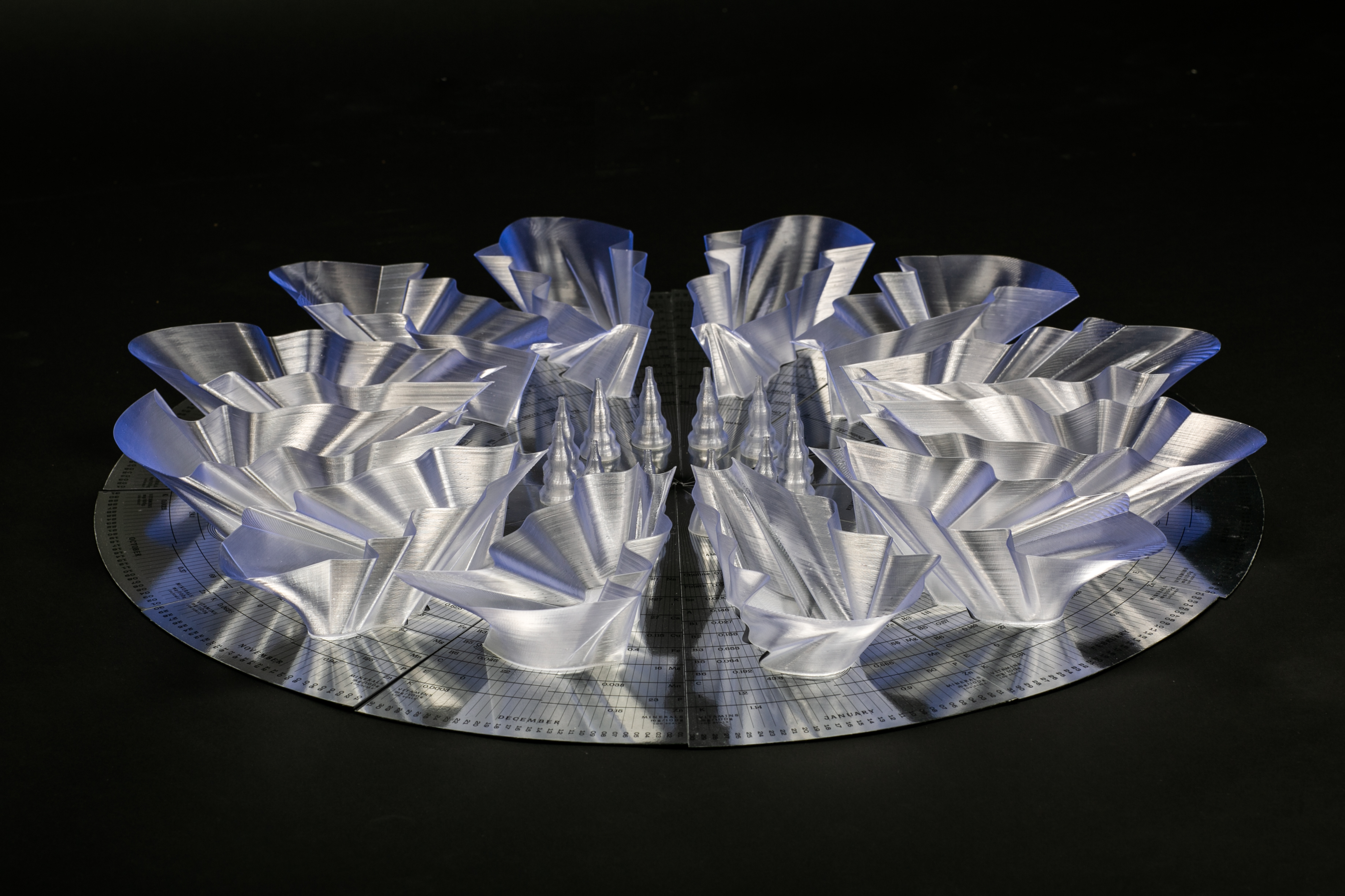
The name is a melting. Take the words Toplarna Tezno Maribor, compress them, distill them, and what emerges is Totem. It is a name that carries the memory of the place—its industrial roots, its location, its history—while opening onto new meanings. A totem is a symbol, a gathering point, a vertical pole that connects earth and sky, ancestors and descendants, the individual and the collective. It is also a structure that can hold many things: carvings, stories, meanings added over time.
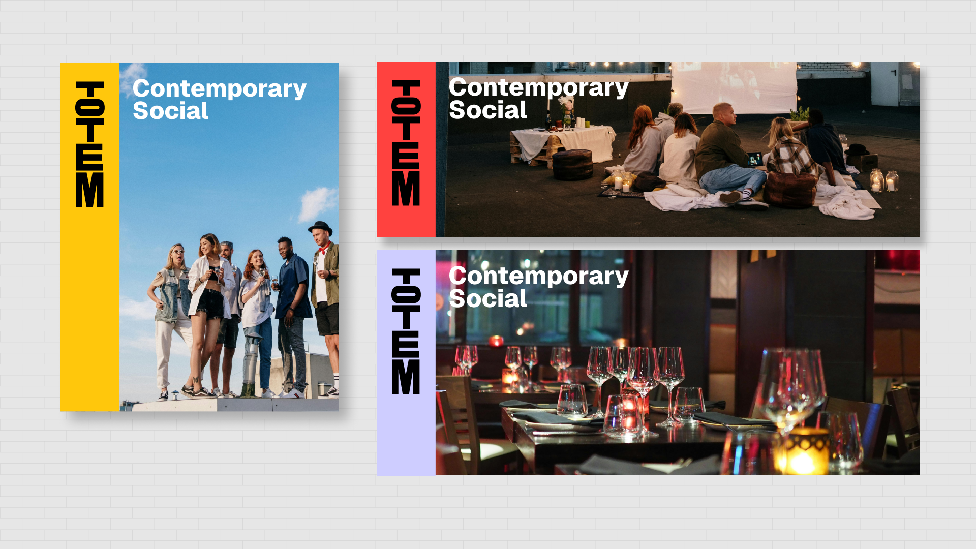
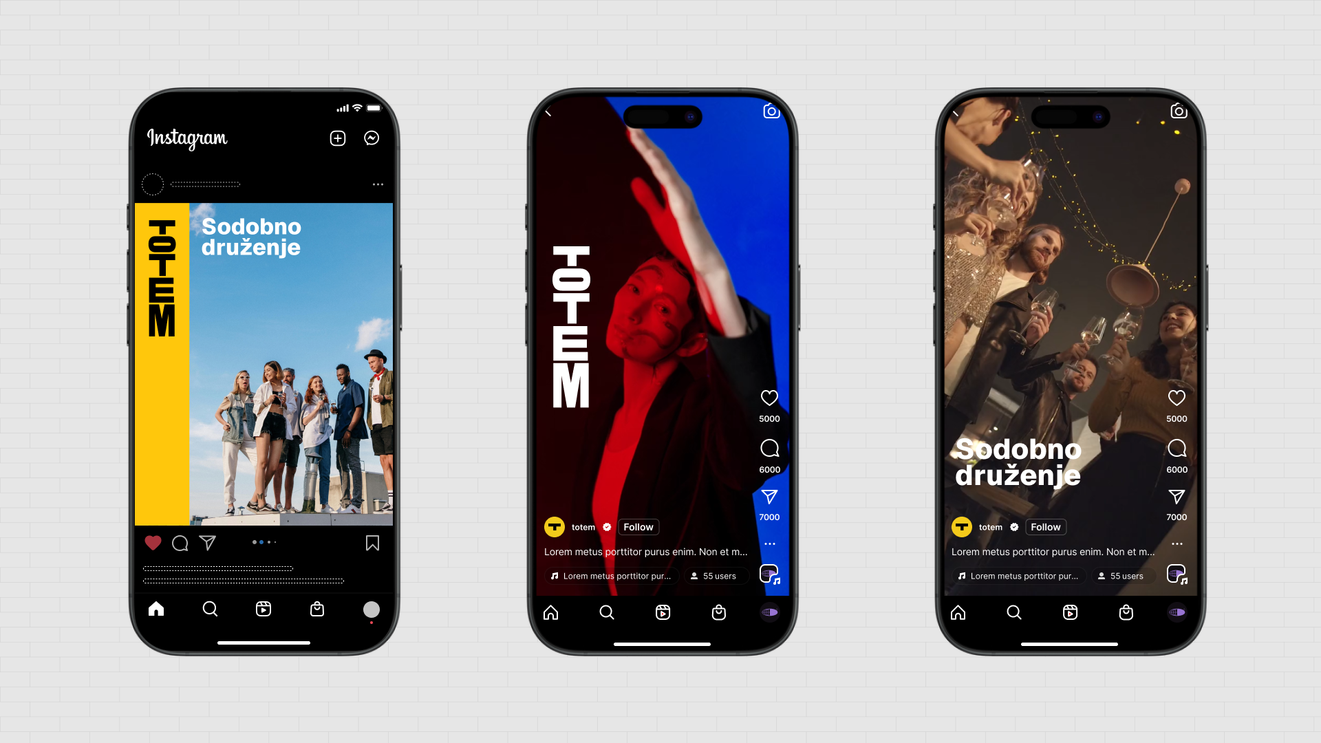
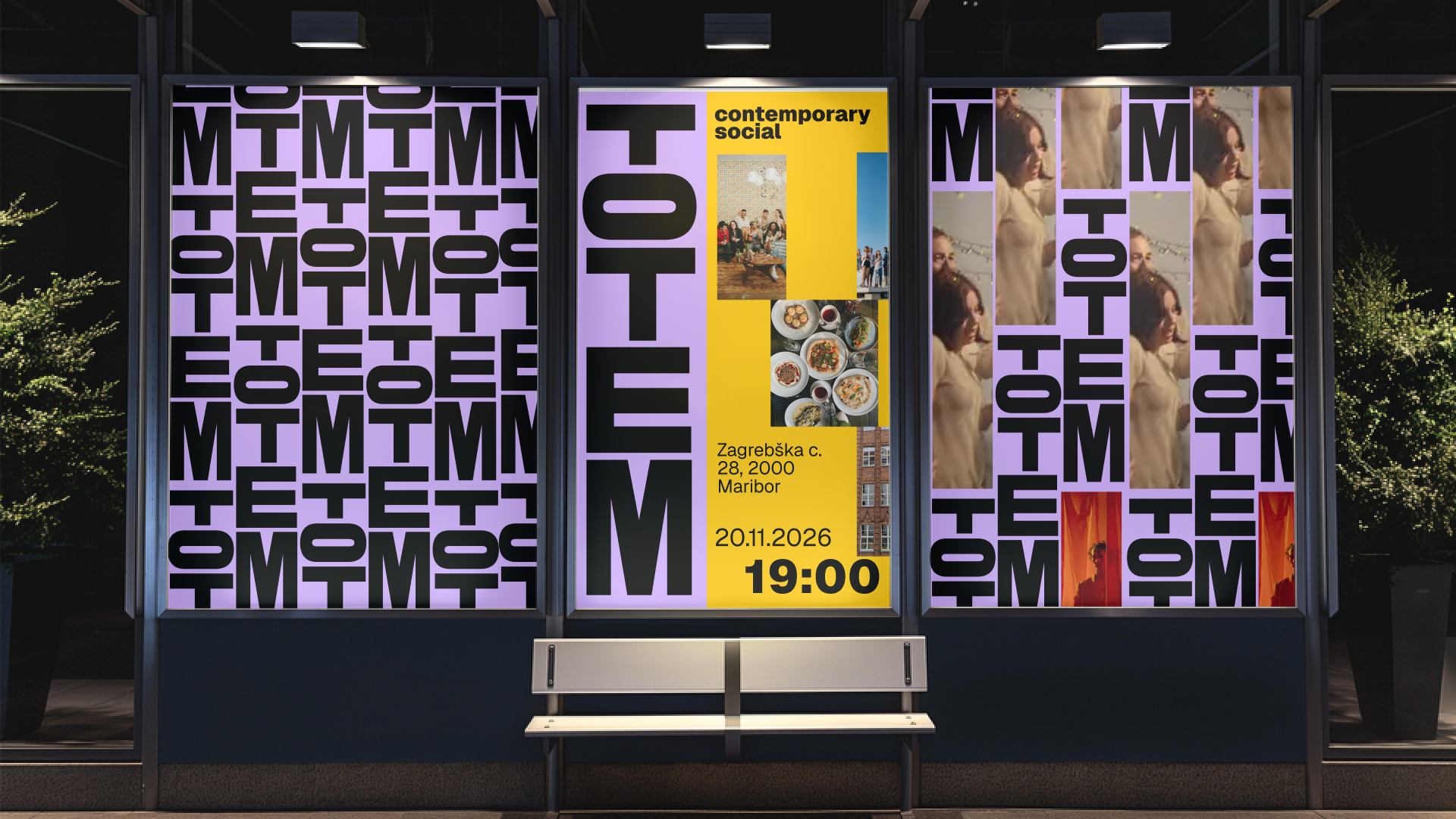
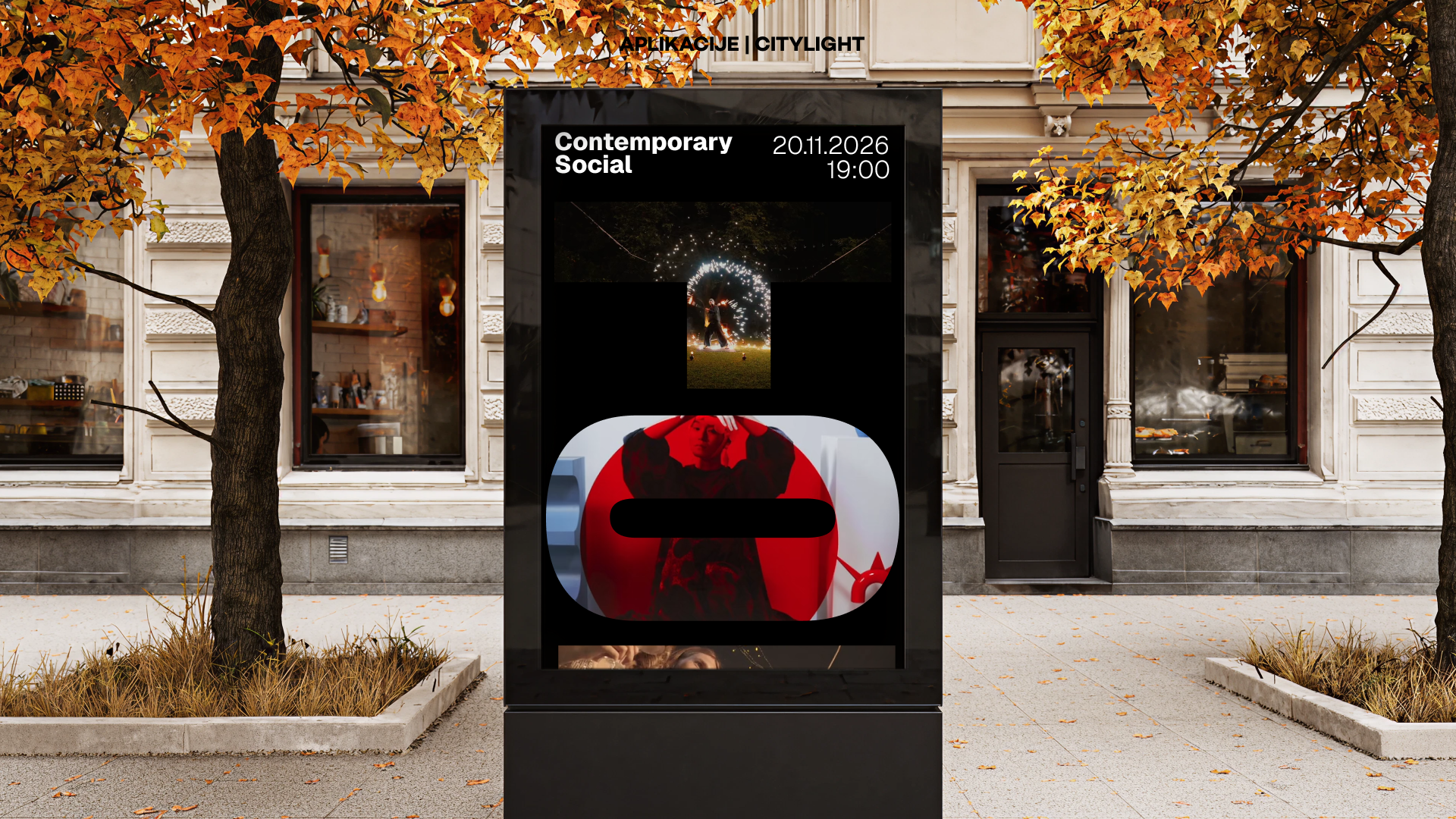
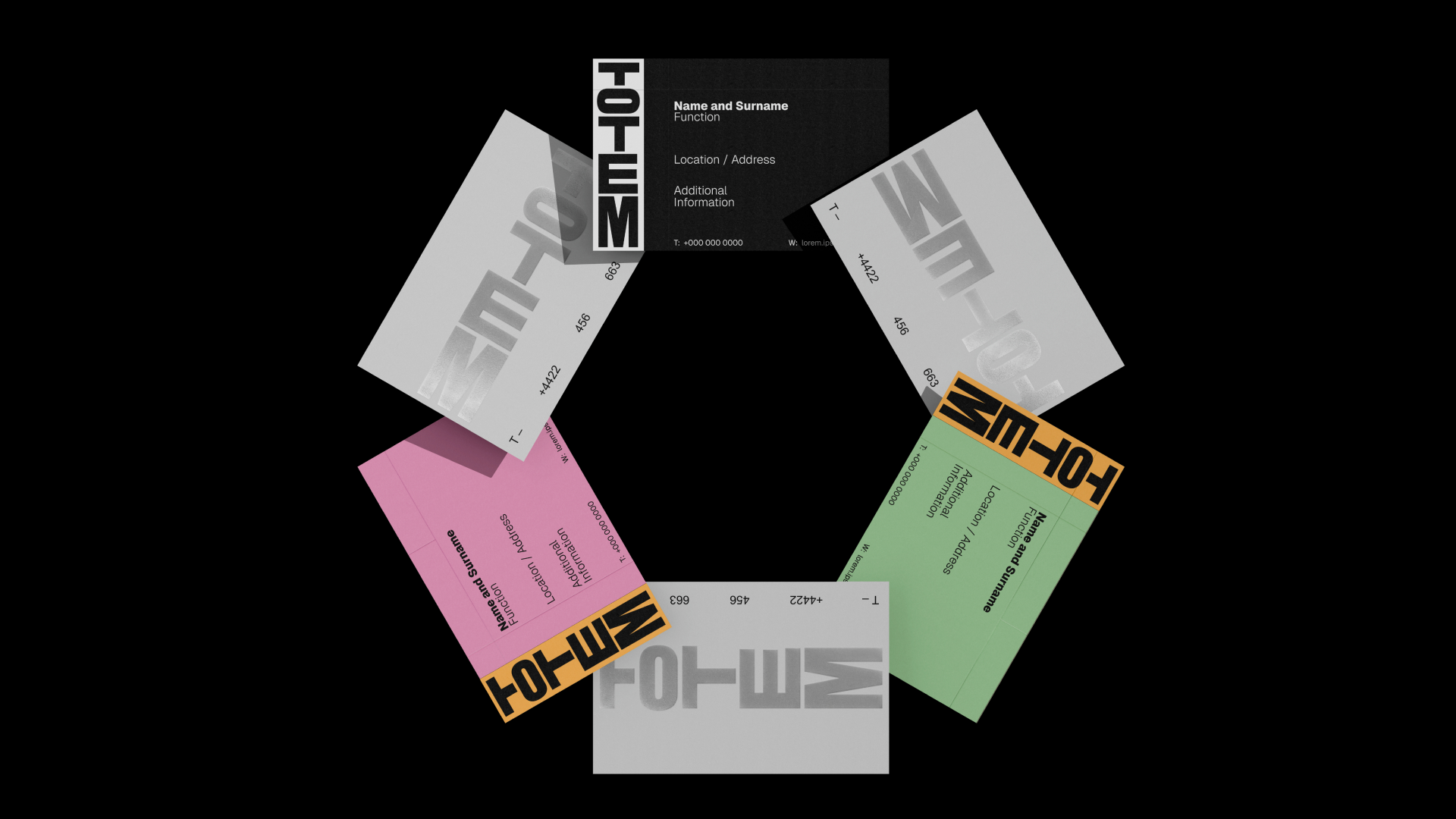
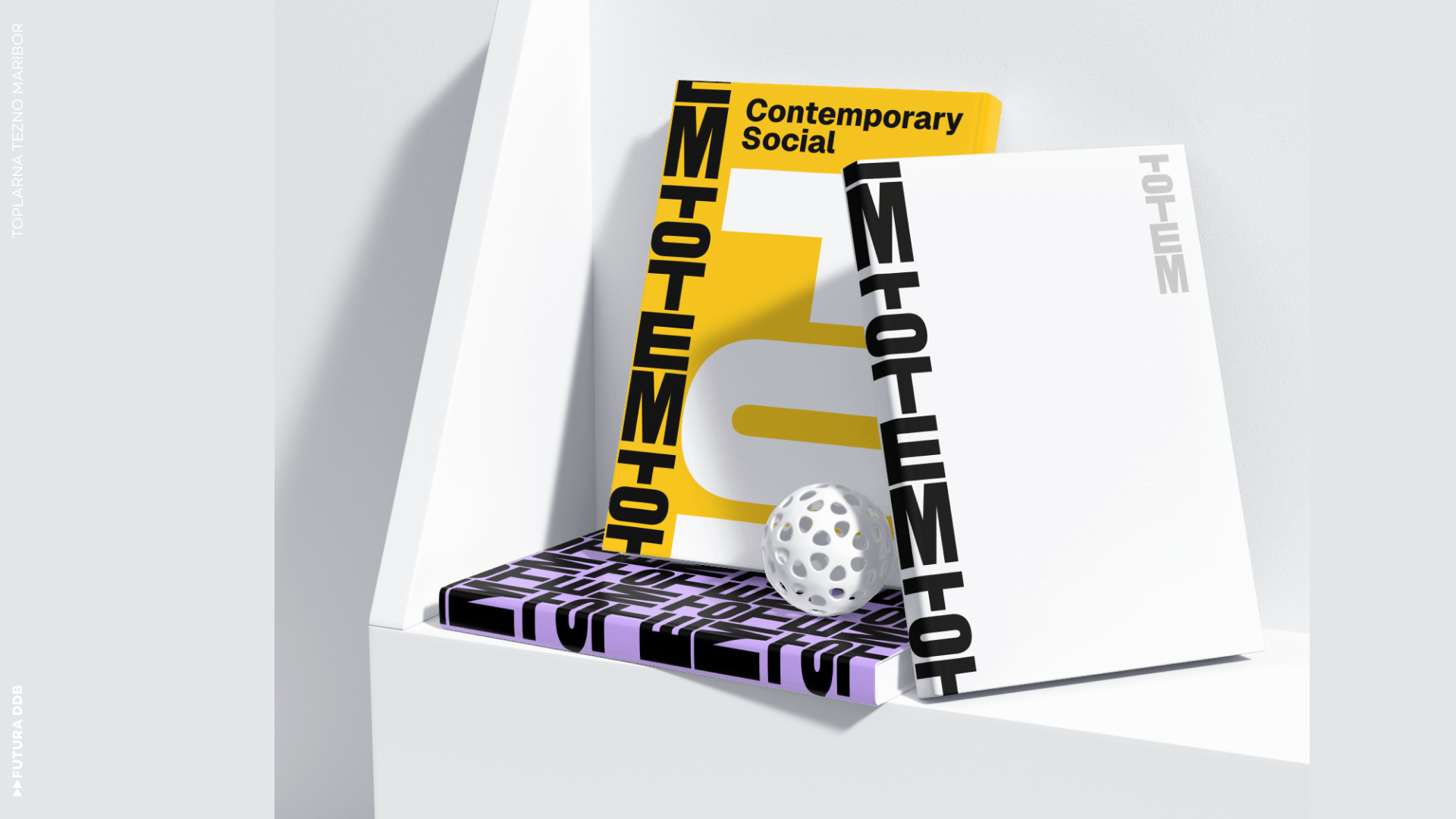
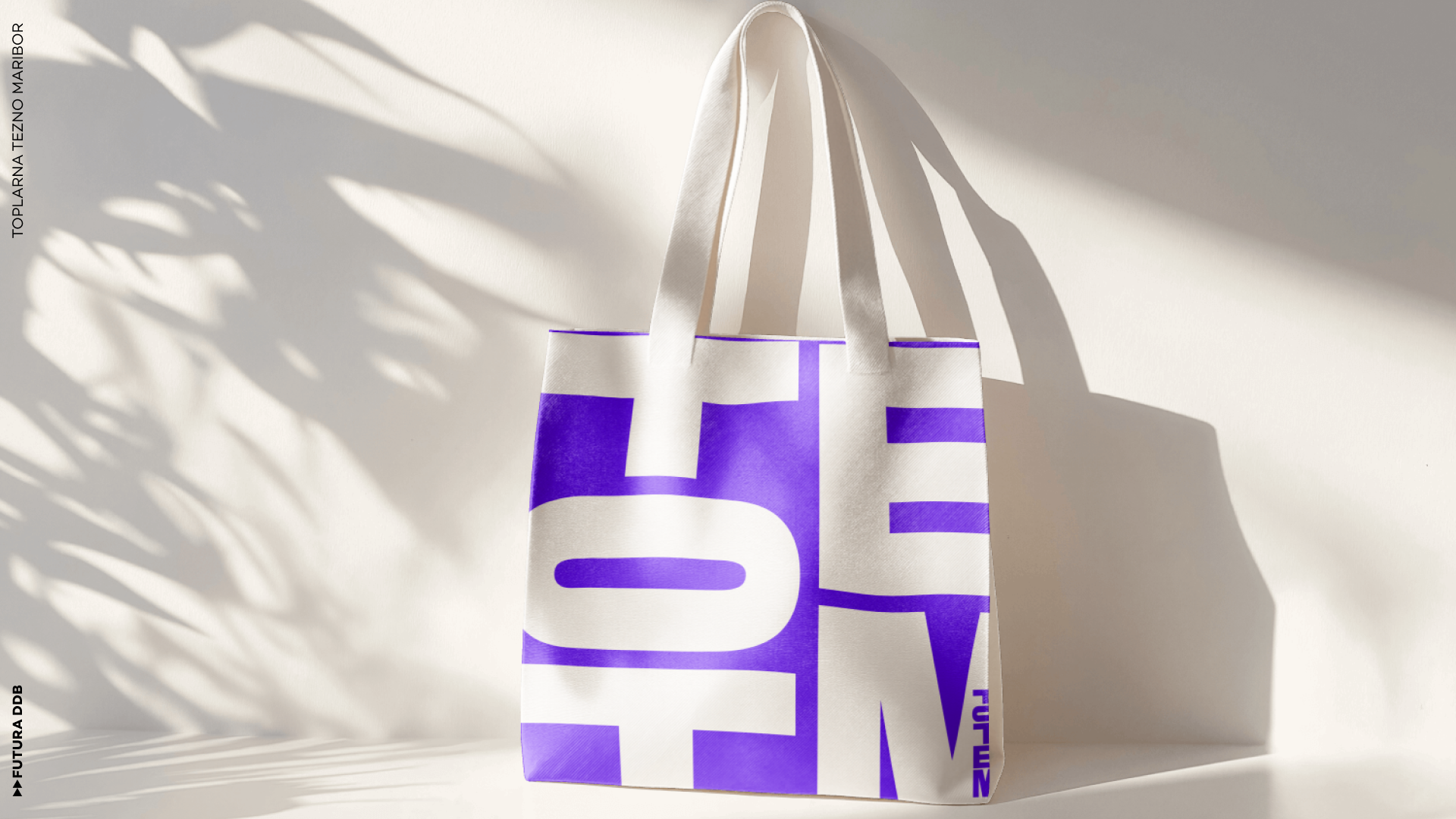
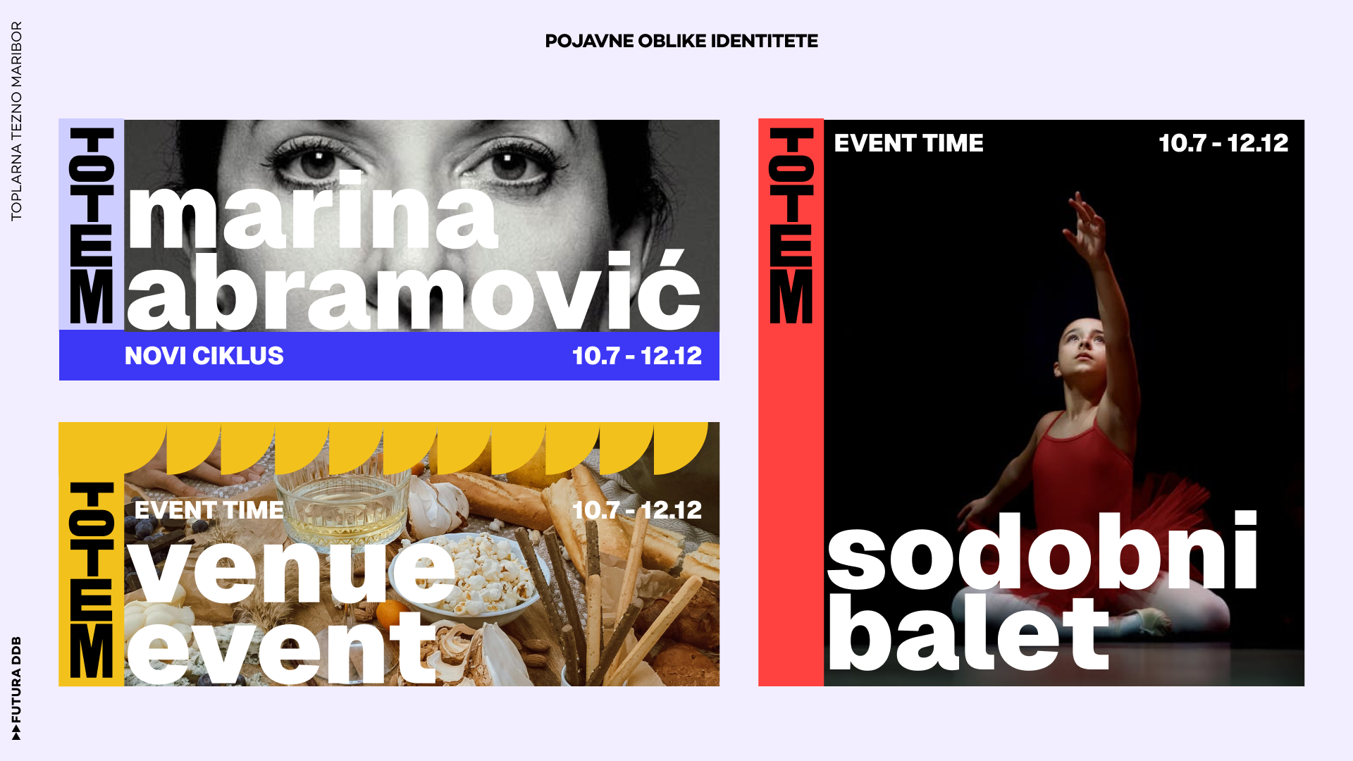
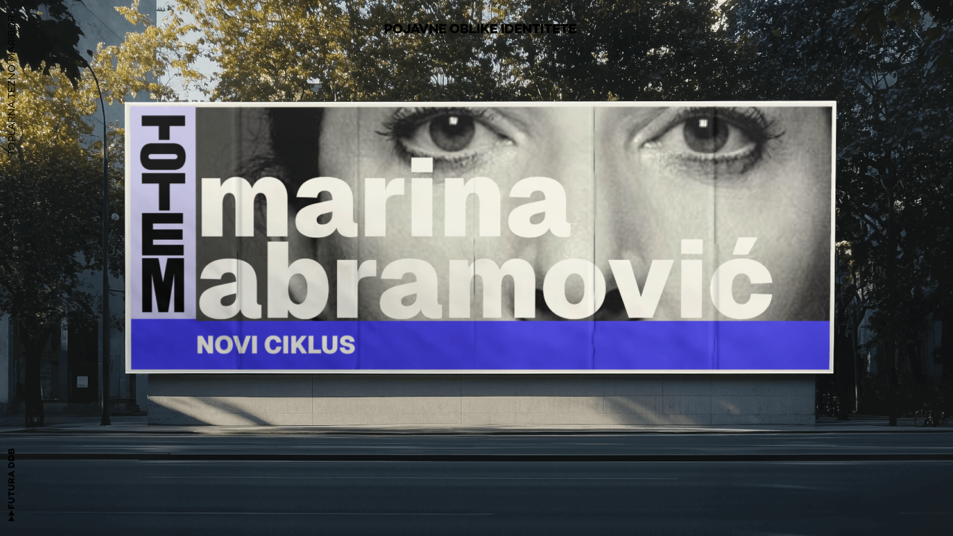
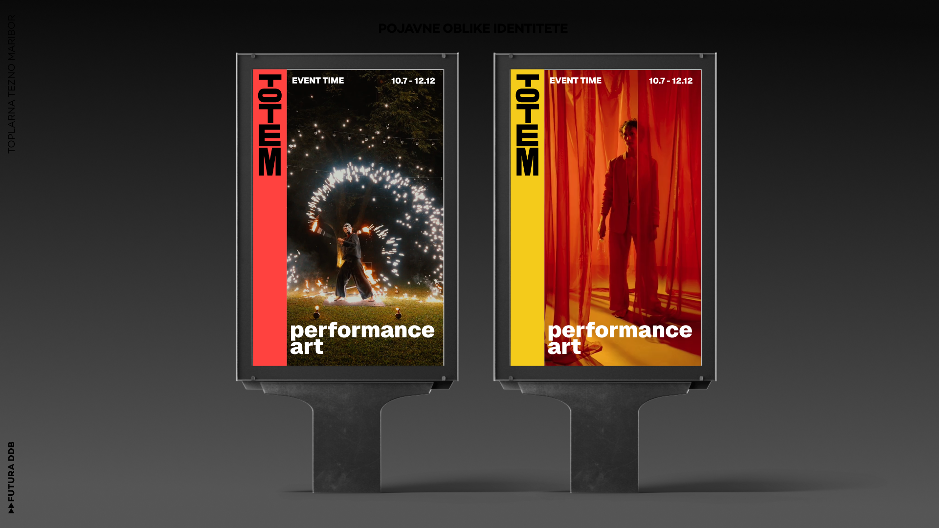
The visual identity is built on this logic. It is vertical, modular, designed to receive. The core structure is a pole, a column, a vertical axis. Into this structure, elements can be placed: the names of events, the work of artists, the marks of the community. The identity does not stand alone; it is a framework, a container for what others bring to it.
Artists who exhibit at Totem place their work within this structure. Their creations become layers on the pole, new stories added to the collective. Over time, the identity grows, accumulates, becomes a record of the center's life. It is not fixed but evolving, not a logo to be repeated but a system to be inhabited.
The verticality of the identity is significant. It echoes the industrial heritage of the site—the chimneys, the towers, the vertical structures that defined the landscape of production. But it also points toward the spiritual and symbolic dimensions of the totem pole: a structure that connects, that gathers, that stands as a marker of place and community.
The identity system is designed to be flexible. It can be used on signage, on printed materials, on digital platforms. It can be scaled, adapted, extended. But its core remains constant: a vertical axis, a structure of reception, a pole that invites others to add their mark.
For Strahinja Jovanović, the project was an opportunity to think about identity not as a static mark but as a living system. Totem is not a logo that sits on a letterhead; it is a framework that evolves with the community it serves. It is designed to be used, to be added to, to be transformed by the artists and visitors who encounter it.
The transformation of Toplarna Tezno Maribor into a cultural center is part of a broader movement: the repurposing of industrial spaces for creative use across Europe. Totem speaks to this moment, offering a visual language that is at once rooted in the history of the site and open to the futures it might hold.
In the end, Totem is about gathering. It is a place where people come together, where artists share their work, where a community builds itself layer by layer. The visual identity is a symbol of that gathering—a pole that stands, a structure that holds, a totem for the culture that grows around it.