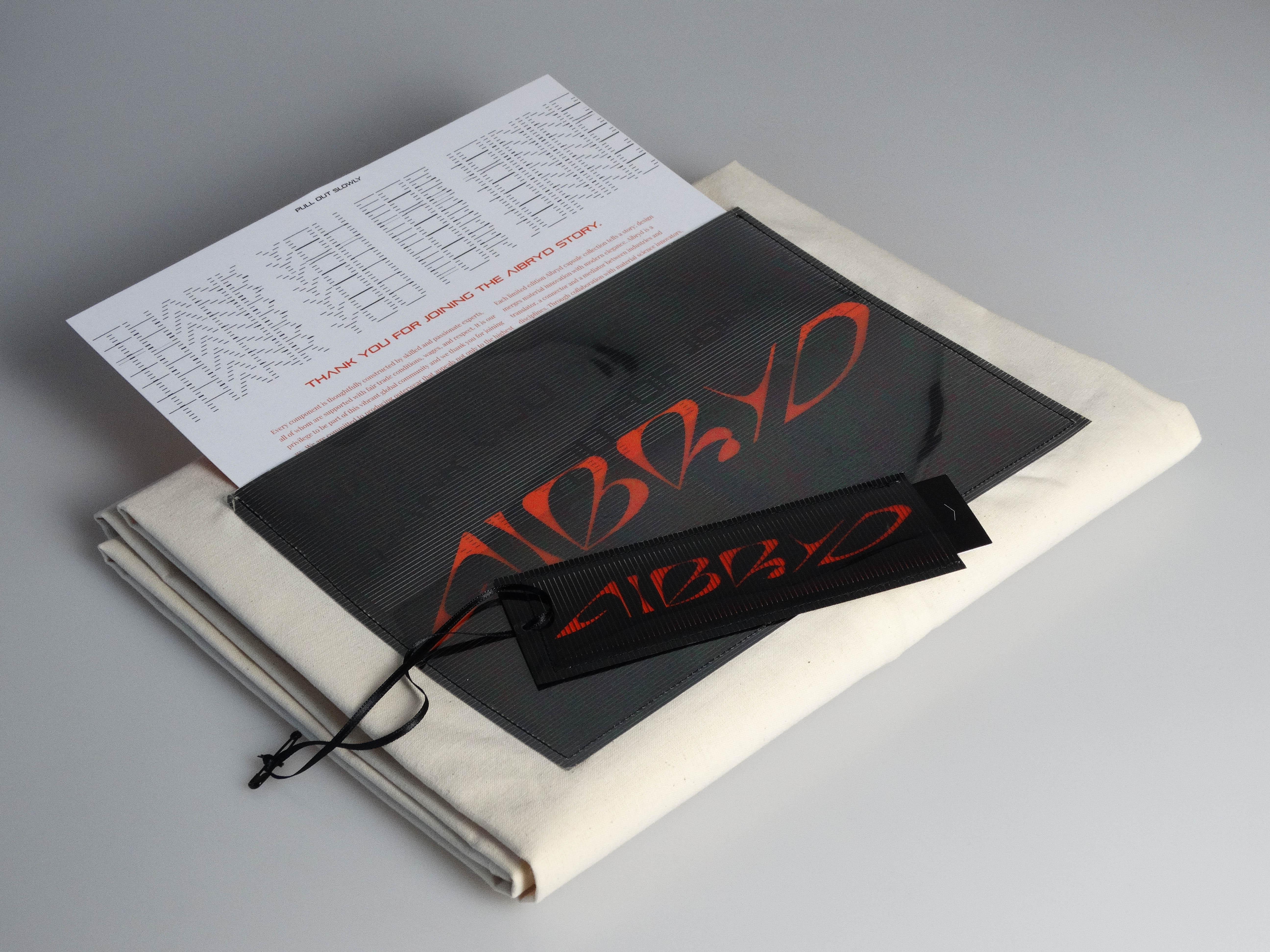
The visual identity for Aibryd reflects the brand's philosophy of fluidity. Clean typography, a landscape-inspired palette, and dynamic imagery create a system that moves seamlessly between utility and elegance—just like the garments themselves.
Aibryd exists in the space between outdoor and urban, function and form. The identity I designed captures this duality: confident yet adaptable, structured yet fluid—a visual language for the conscious explorer.
Each element of Aibryd's visual system speaks to transition. Typography shifts weight; colors move between earth and city; imagery captures garments in motion. The identity is built for a brand that refuses to be pinned down.
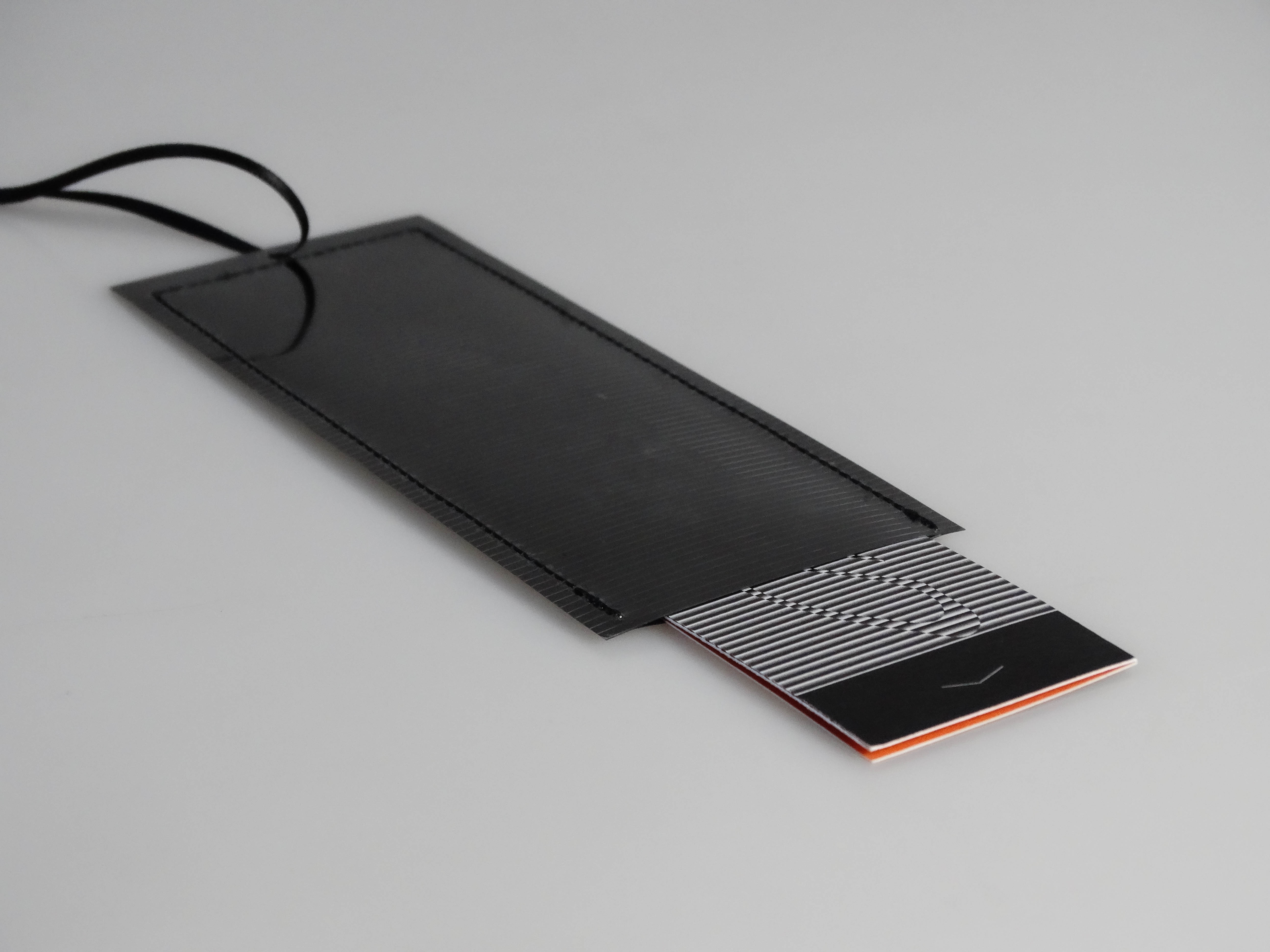
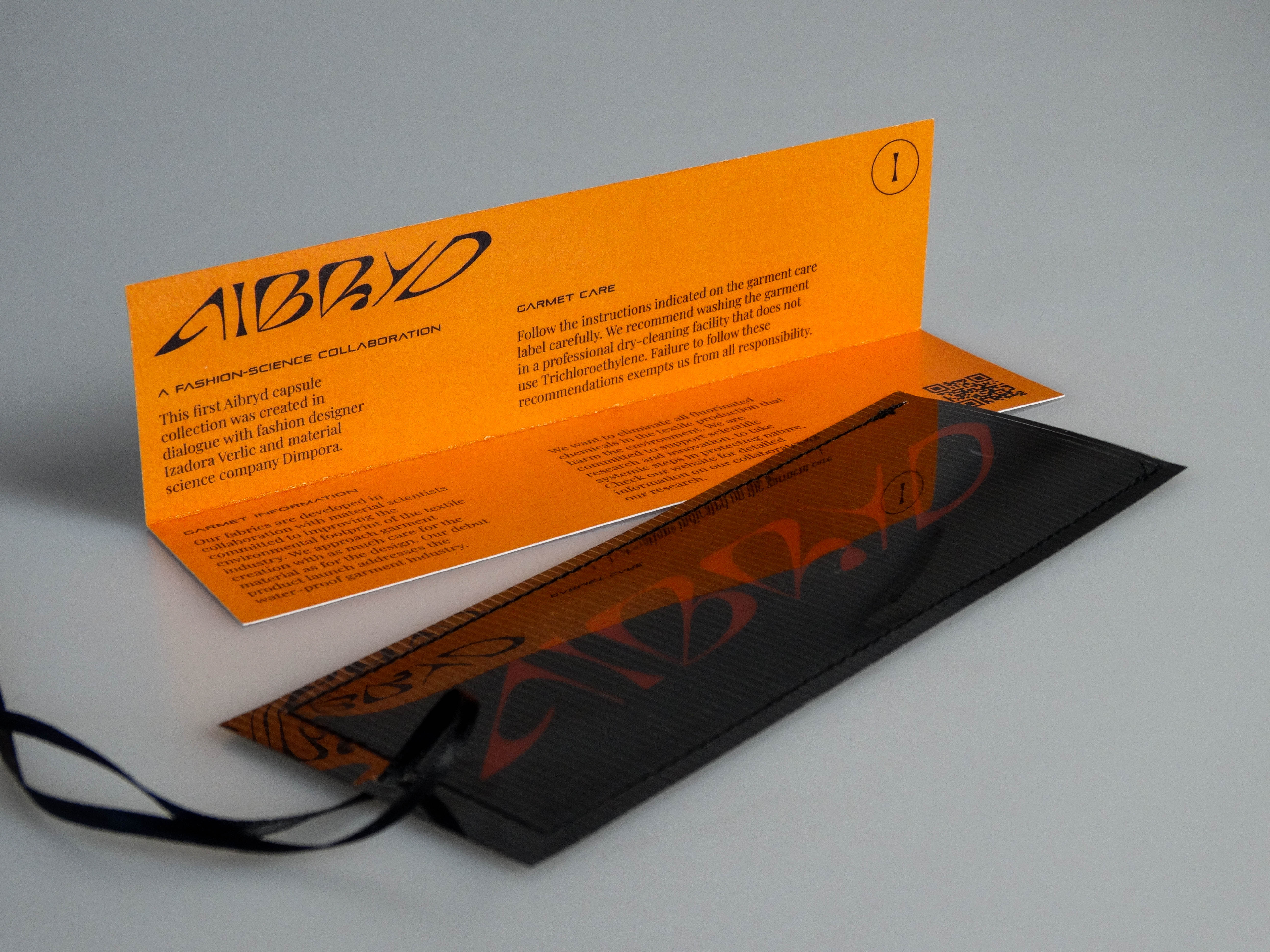
Aibryd is a fashion brand built on a radical premise: clothing should move with us across the lives we live. Its garments—hybrid knits and rain-wear—are designed for the conscious explorer, for those who refuse to choose between urban sophistication and outdoor utility. My role in the project was to create a visual identity that could communicate this philosophy with clarity, elegance, and precision.
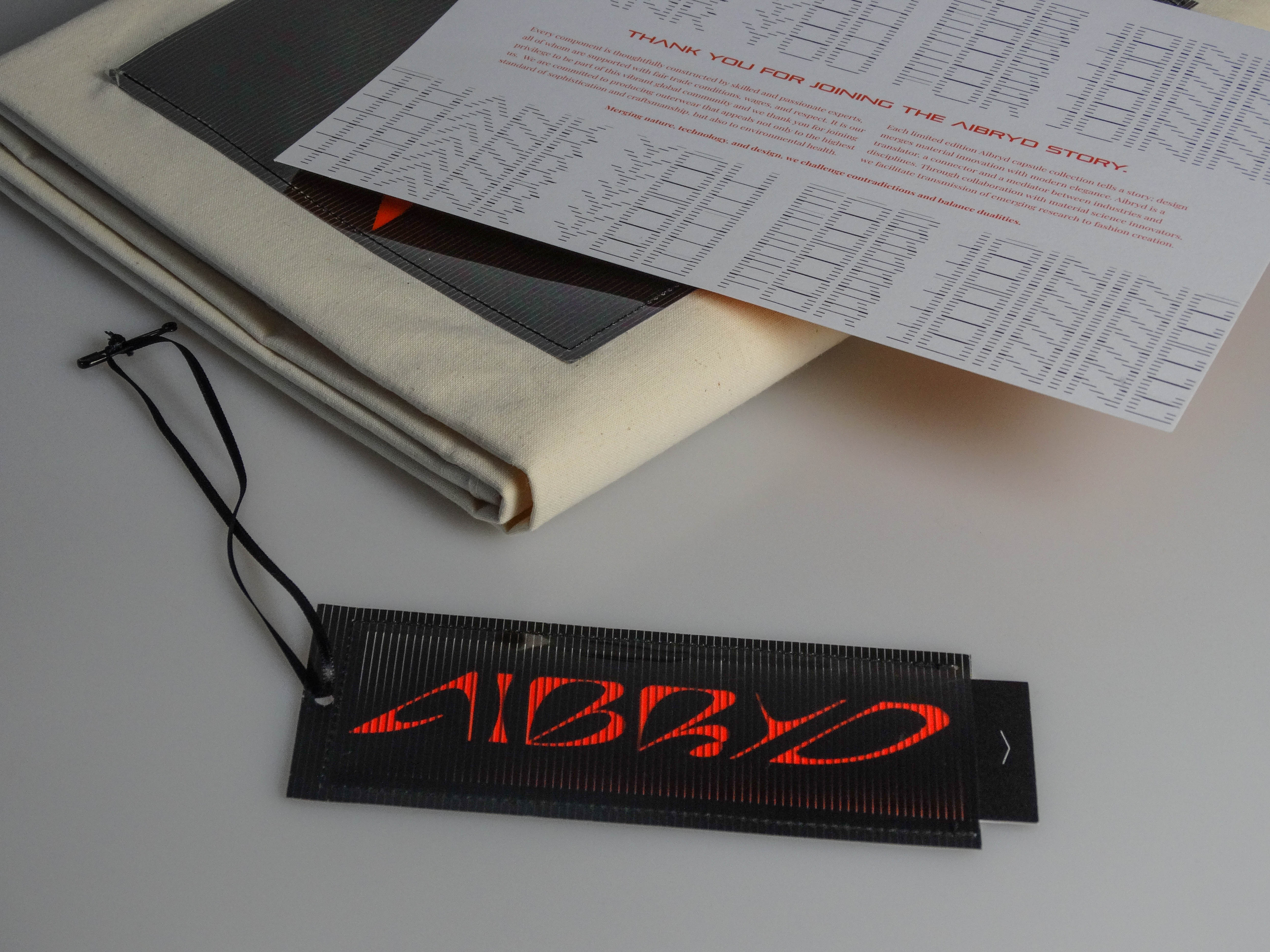
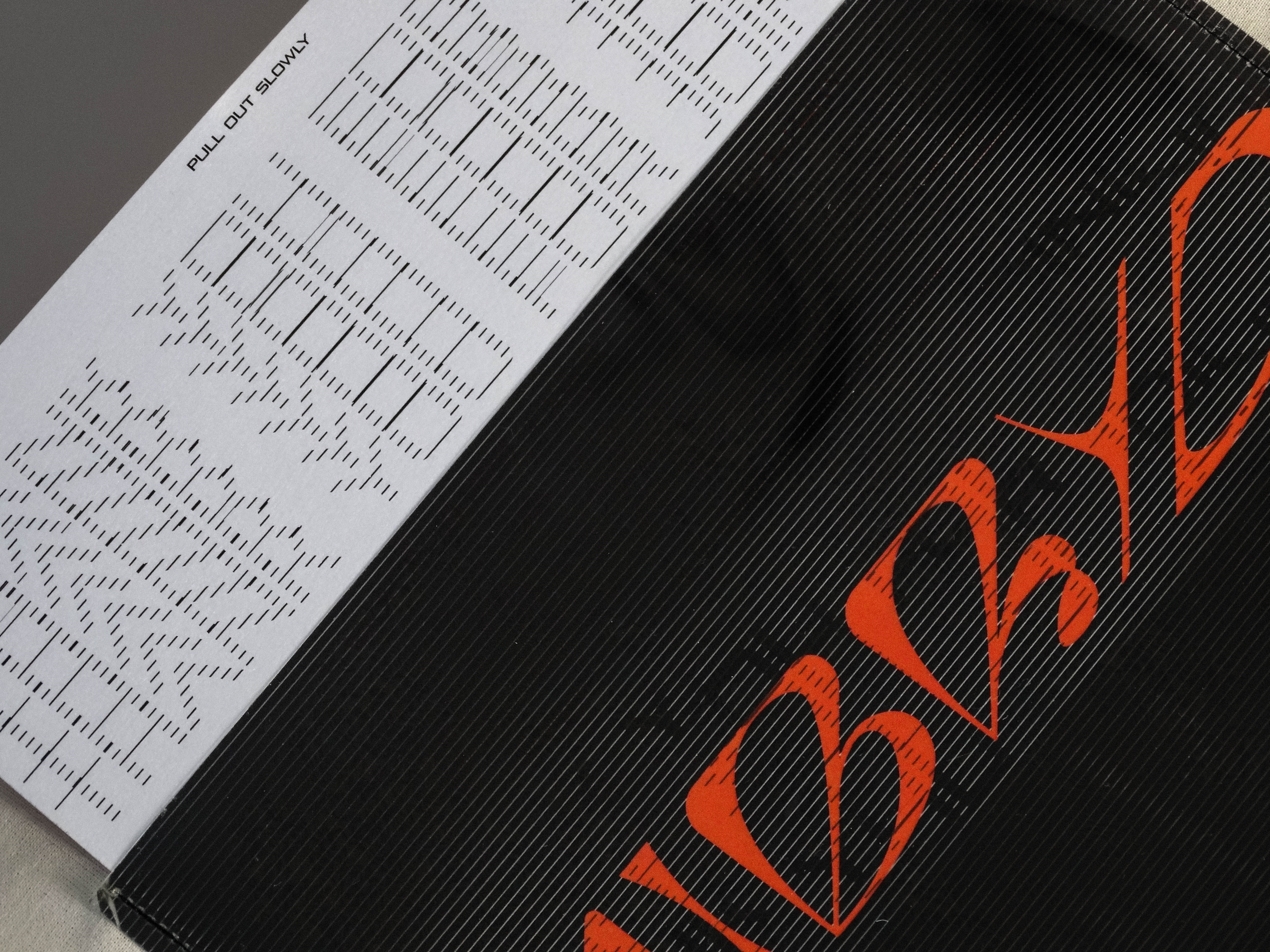
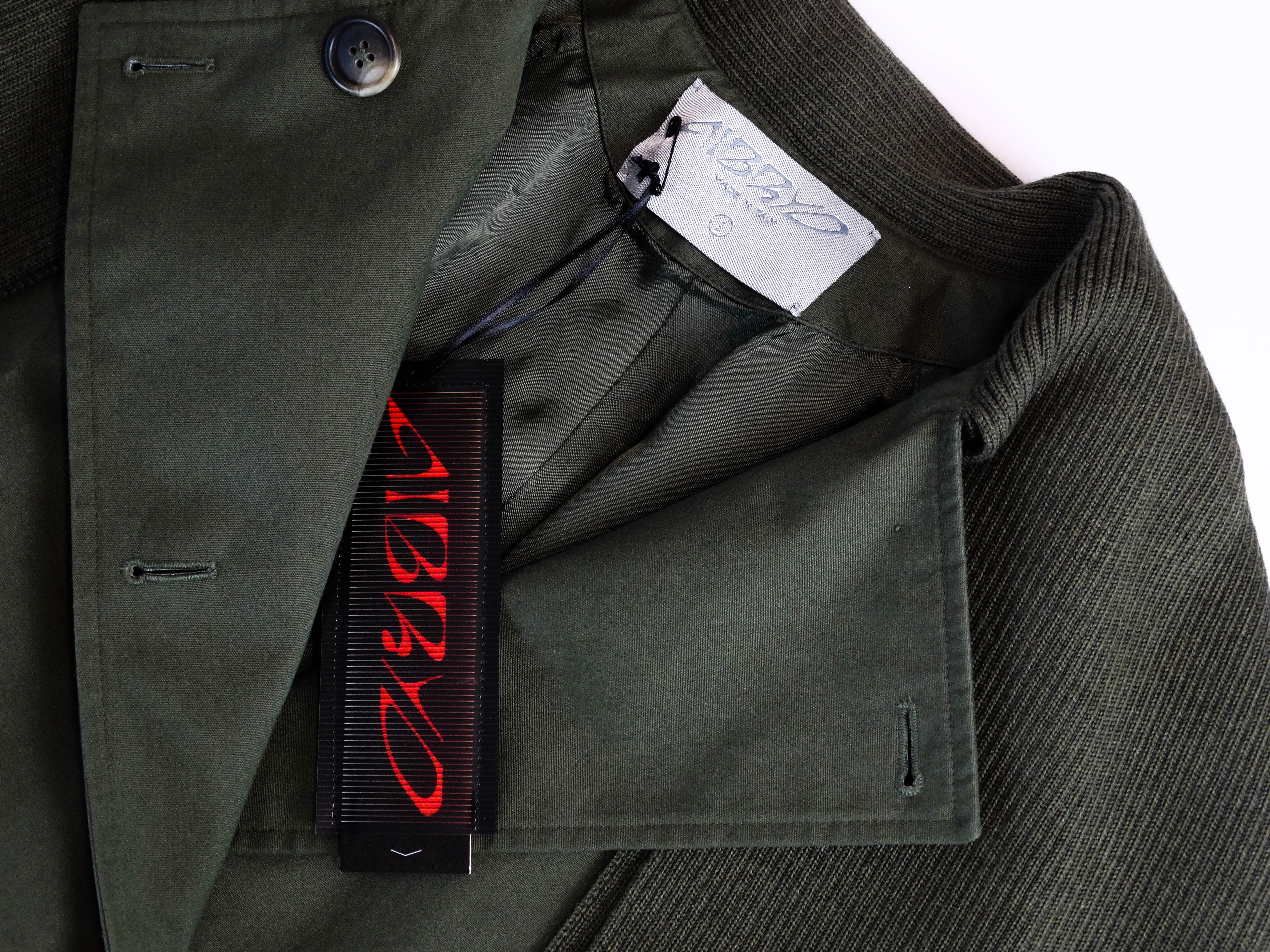
The identity begins with typography. I chose a typeface that balances confidence with approachability—clean enough to feel architectural, warm enough to invite. The letterforms have weight but not heaviness, structure but not rigidity. They suggest a brand that knows where it stands but remains open to where it might go.
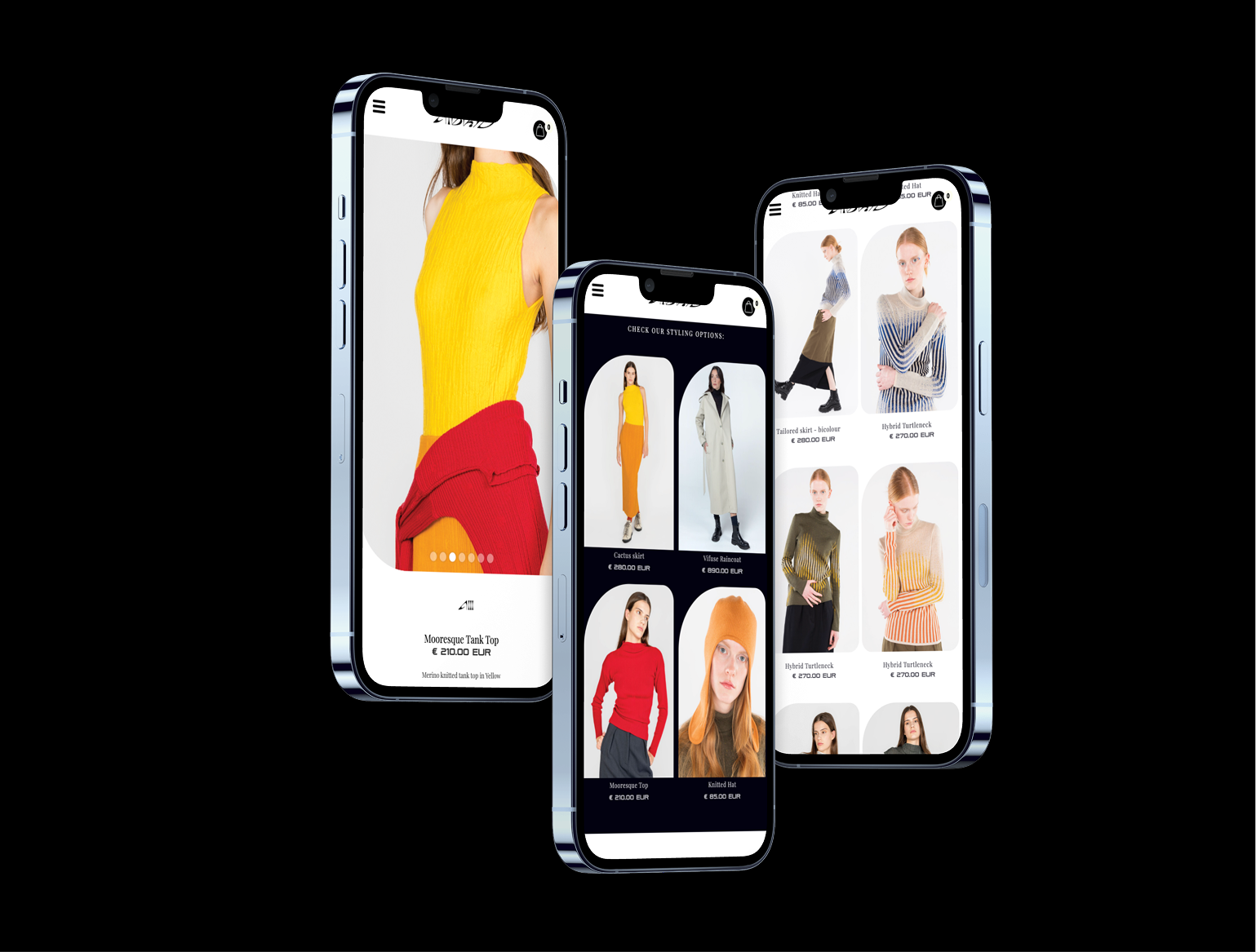
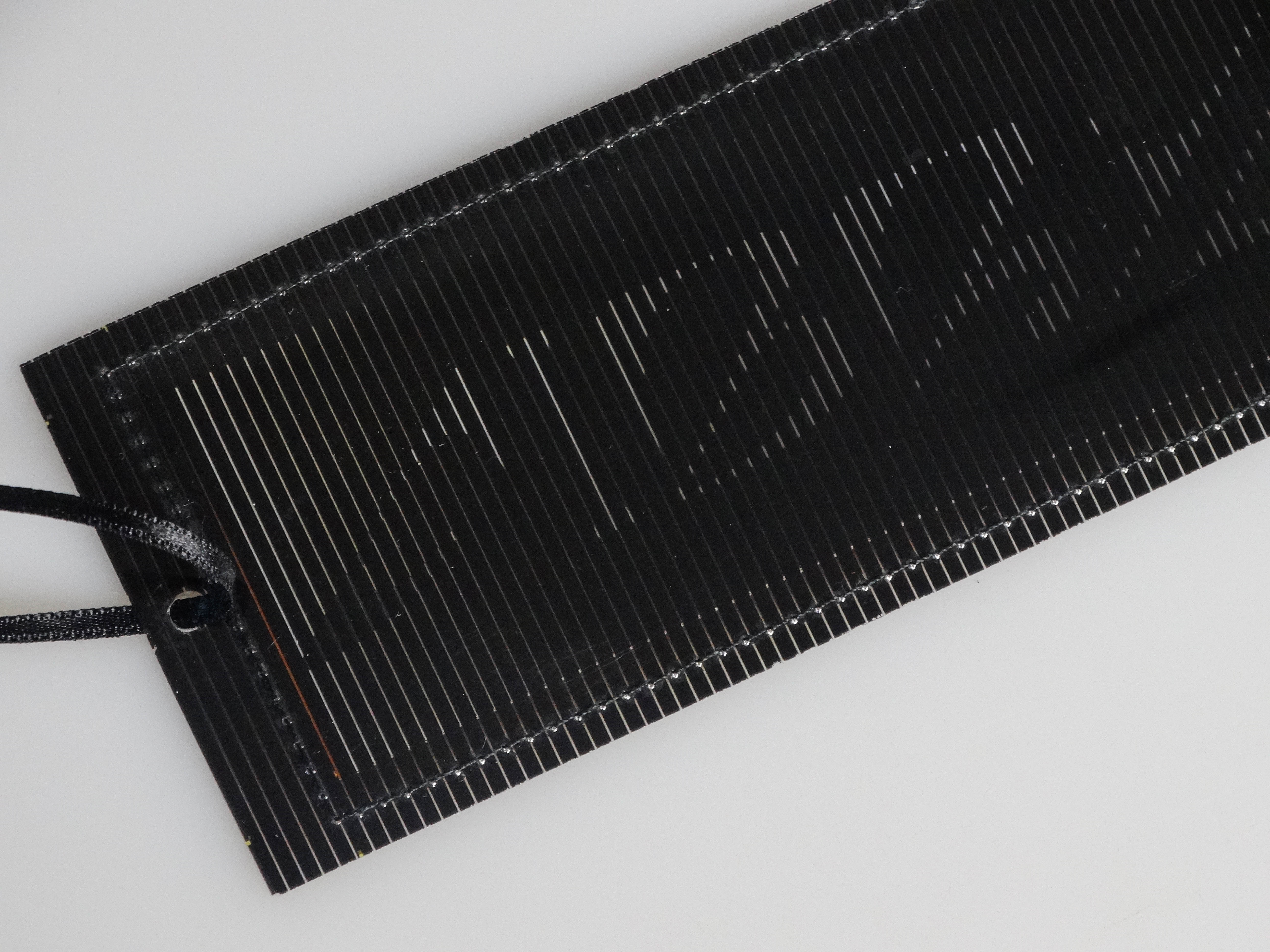
The color palette draws from the landscapes Aibryd inhabits. Deep greens evoke forests, muted blues suggest the horizon, warm earth tones ground the brand in the natural world. But there are also grays, blacks, the shimmer of wet pavement—colors that speak to the city, to the urban contexts where these garments are equally at home. The palette is designed to transition, to move between realms, to reflect the hybrid nature of the brand.
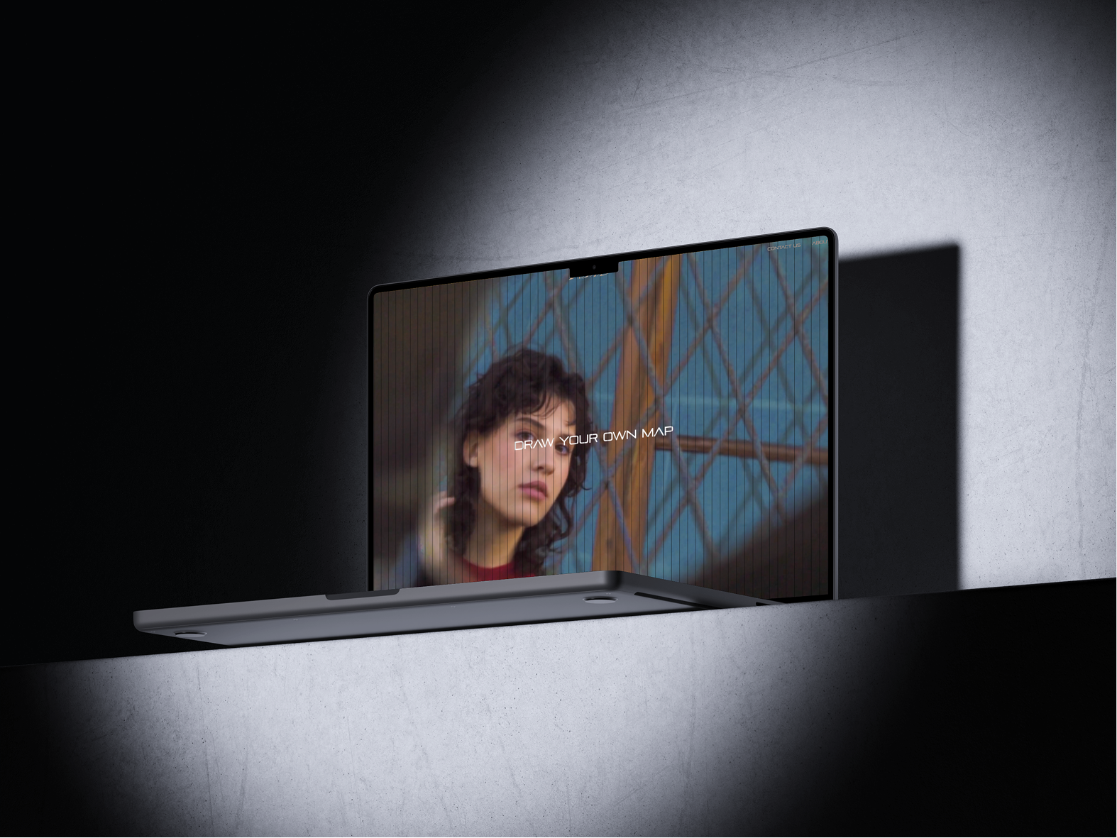
Imagery direction was another critical element. I worked to create a visual language that captures garments in motion, in transition, in the spaces between categories. The images are dynamic but not hurried, confident but not aggressive. They show the pieces being worn—on trails, in streets, in the moments between destinations. The message is clear: these are clothes for the journey, not the arrival.
The identity system is built to be flexible. It adapts across applications: e-commerce, social media, lookbooks, packaging. It is rigorous enough to hold together, flexible enough to surprise. The brand's tagline—"Draw your own map"—applies to the visual identity as well as the garments. It is a system designed for exploration, for discovery, for the wearer to make their own meaning.
Working on Aibryd required thinking across disciplines. The identity had to speak to the functional qualities of the garments—their durability, their weather resistance, their utility—but also to their aesthetic ambitions. It had to appeal to the conscious consumer, the one who cares about materials and construction, but also to the fashion-forward, the one who seeks beauty and distinction. The identity had to hold these tensions together, to be both practical and poetic.
The result is a visual language that feels true to the brand. It is calm but confident, precise but open, built for a world where categories are less fixed than they used to be. Aibryd's garments move between realms; the identity does too.
For me, Aibryd was an opportunity to design for a brand that is reimagining what fashion can be. It is a project about fluidity, about transition, about the lives we lead when we refuse to choose. I am proud to have contributed to its visual identity—a map for those who draw their own.
.gif)