From Spanish Flu to COVID-19, this infographic traces the history of virus epidemics across two centuries. Through careful data visualization, it reveals patterns of outbreak, impact, and human vulnerability—a story told in numbers and forms.

Incubation periods, death tolls, timelines of transmission—the infographic transforms epidemiological data into visual narrative. It asks us to see epidemics not as isolated events but as interconnected stories across time.
How do we make sense of a century of outbreaks? This infographic uses design to organize complexity, making visible the patterns that connect pandemics. An exploration of history, data, and the visual language of public health.


In 2020, as the world grappled with the unfolding COVID-19 pandemic, Strahinja Jovanović created an infographic tracing the history of virus epidemics across the 20th and 21st centuries. The project was timely, but not opportunistic. It was a work of historical synthesis, of data visualization, of design as a tool for understanding. It asked: what can we learn from a century of outbreaks?
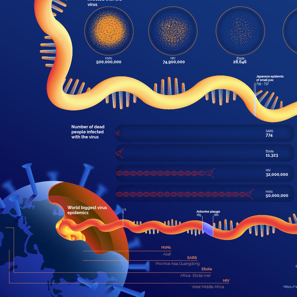
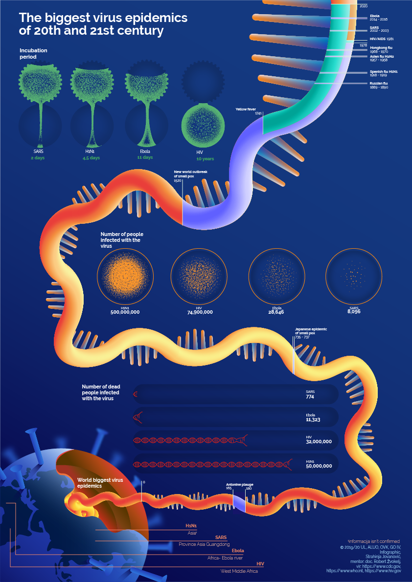
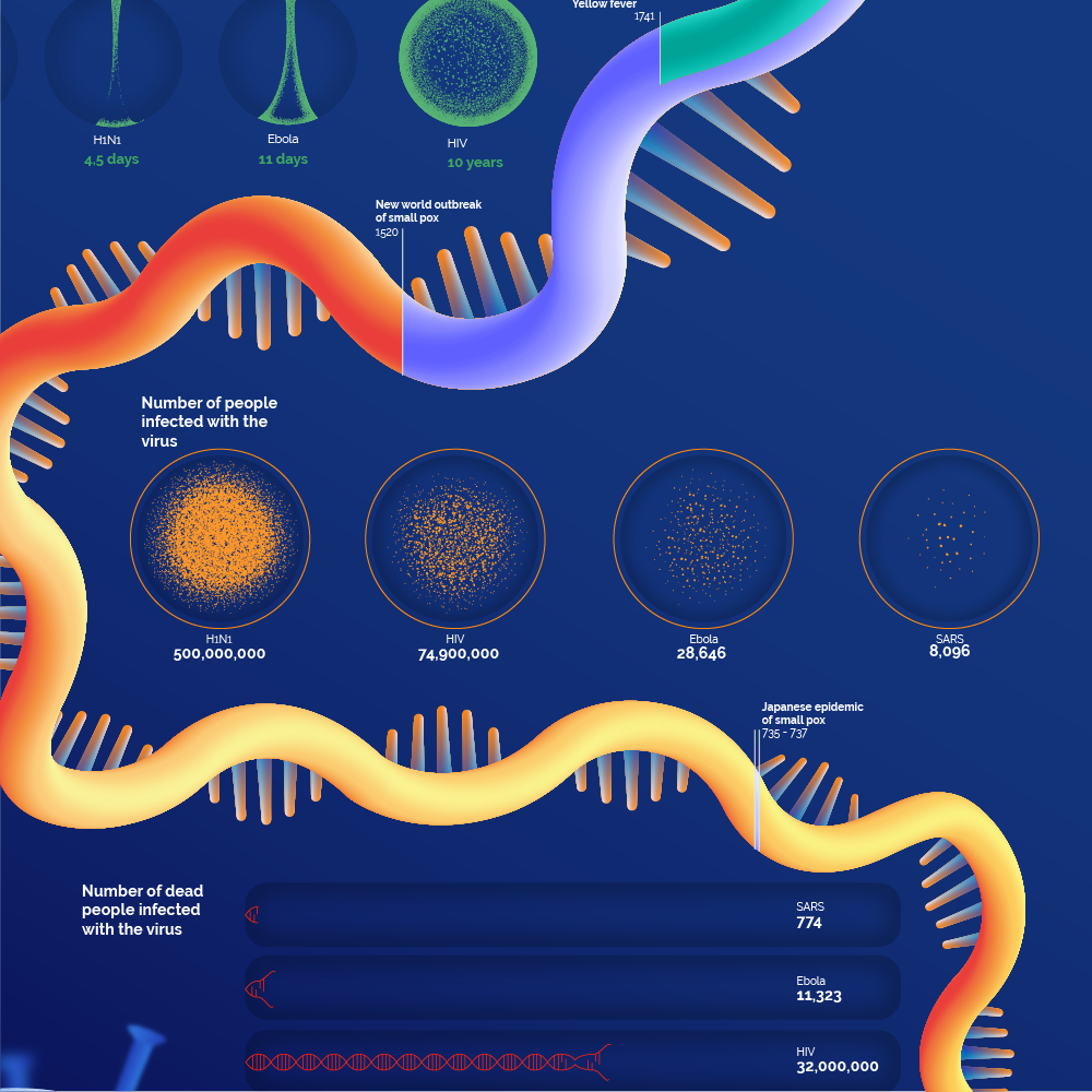
The infographic covers the major epidemics of the modern era: the Spanish Flu of 1918, the Asian Flu of 1957, the Hong Kong Flu of 1968, the HIV/AIDS pandemic, SARS, H1N1, Ebola, and others. Each epidemic is represented as a node in a larger narrative, connected by lines of transmission, comparison, and consequence. The viewer is invited to explore, to trace relationships, to see the patterns that emerge across decades.
The data is carefully selected and organized. Incubation periods—the time between infection and symptoms—are shown as intervals, suggesting the windows in which transmission occurs undetected. Death tolls are rendered as scaled forms, giving visual weight to the human cost of each outbreak. Timelines unfold across the composition, revealing the rhythms of emergence, peak, and decline. The history of virology itself is woven into the design, showing how scientific understanding has evolved alongside the diseases it studies.
The visual language is precise and restrained. The infographic does not sensationalize; it informs. Color is used to differentiate epidemics, but without alarm. Scale is used to convey magnitude, but without distortion. The design is dense but navigable, inviting sustained engagement rather than quick scanning. It is a work to be read, to be studied, to be returned to.
The context of the project is significant. Created in 2020, at the height of the COVID-19 pandemic, The Biggest Virus Epidemics offered a way of seeing the present in relation to the past. It suggested that pandemics are not unprecedented events but recurring phenomena, that each outbreak carries echoes of those that came before, that history offers lessons if we know how to read them.
For Strahinja, the project was an exercise in information design—in taking complex, often overwhelming data and rendering it accessible. It required research, synthesis, and a commitment to accuracy. The design had to balance clarity with density, narrative with data, historical scope with visual coherence.
The infographic also reflects a broader concern in Strahinja's work with systems and structures. Across his portfolio, he has explored how information can be organized, how complexity can be made legible, how design can help us understand the world. The Biggest Virus Epidemics is a direct application of these interests: a system for understanding a century of outbreaks, a structure for holding epidemiological data, a visual argument for the importance of design in public health communication.
In the years since, the infographic has taken on new resonance. The COVID-19 pandemic has become part of the history it charts, a new node in the narrative. The project stands as a record of what was known, and as a reminder that design can help us see patterns that might otherwise remain hidden.