What does it mean to mark the passage of time? This New Year stamp explores transition as a movement from closed to open, from what was to what will be. Forms shrink in golden ratio; colors shift with emotion.
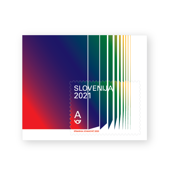
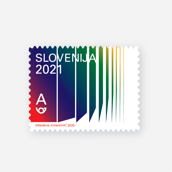
Drawing on Plutchik's theories, the stamp uses green, blue, red, and yellow to evoke the feelings of New Year: joy, surprise, admiration, optimism, love. Each color a note in the transition from old to new.
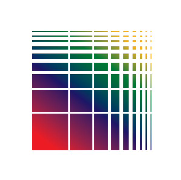

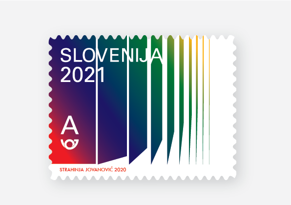
Each form is shorter than the last, following the golden ratio—a nod to divine beauty, balance, the structure of growth. The stamp becomes a meditation on the moment of transition, the opening of a new day.


In 2019, Strahinja Jovanović designed a New Year stamp for Slovenia, a project that asked what it means to mark the passage of time. The stamp is small—postage stamps are, by necessity, small—but its ambitions are large. It seeks to capture the essence of transition: the movement from old to new, from closed to open, from one year to the next.
The project began with reflection. In an age of digitalization and hyper-information, the transition to a new year passes quickly, marked by a countdown, a moment of celebration, then the ordinary rhythm of days resumes. But Strahinja was interested in what happens in that moment—the transition itself, not as a point on a timeline but as a process, a movement, a becoming.
He explored the history of marking the New Year, the rituals that have accompanied the transition across cultures and centuries. He considered the feelings that dominate the season: joy, surprise, admiration, optimism, love. He turned to the work of psychologist Robert Plutchik, who studied the relationship between color and emotion, mapping feelings onto a wheel of hues. From this research emerged a palette: shades of green, blue, red, and yellow—colors that speak to the excitement of something new, the warmth of gathering, the hope that accompanies a fresh start.
The form of the stamp is equally considered. Each shape is shorter than the previous, following the proportions of the golden ratio—a mathematical principle often associated with beauty, balance, and the structure of natural growth. The sequence suggests a narrowing, an opening, a movement from a closed part to an open part. It is the shape of transition itself: the passage from what was contained to what is emerging.
The stamp is a meditation on the nature of time. Not time as linear progression, but time as texture, as feeling, as the rhythm of opening and closing. The forms shrink, the colors shift, and the viewer is invited to feel the transition, to experience the passage of the old year into the new.
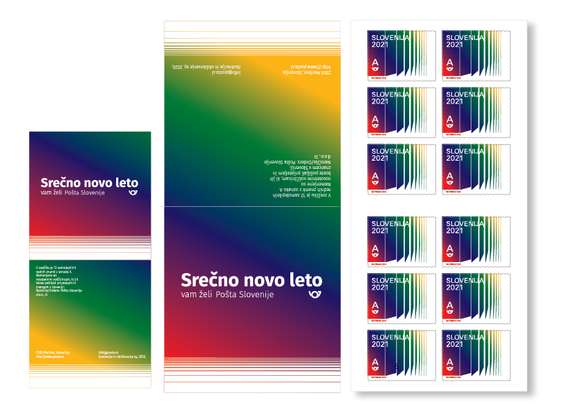
The project also engages with the materiality of stamps. Stamps are functional objects—they carry mail, mark postage—but they are also miniature works of art, circulated, collected, held. The New Year stamp becomes a small ambassador of feeling, traveling across envelopes, marking correspondence, carrying the emotion of the season into the everyday.
For Strahinja, the project was an opportunity to work within constraints—the small format, the public function, the specific occasion—while still exploring the questions that animate his practice. The stamp is a meditation on transition, on time, on the emotions that accompany new beginnings. It is a work of graphic design that is also a work of philosophy, small in scale but large in implication.
In the end, the stamp asks us to pause, to attend to the moment of transition, to feel the shift from closed to open. It is a reminder that the New Year is not only a date on a calendar but a movement, a becoming, a passage that we mark and freeze in memory.
.gif)