Ekten’s visual identity reflects its position as a global leader in sustainable industrial technology. The design balances precision with environmental responsibility—clean, confident, engineered for a cleaner future.


Specializing in air filtration and sustainable industrial solutions, Ekten needed an identity that communicates reliability and innovation. The visual system speaks to both technical expertise and environmental commitment.

With projects in over 40 countries and a reputation for custom, turnkey solutions, Ekten’s brand identity captures its dual nature: globally capable, locally grounded. The design is rigorous, adaptable, and unmistakably professional.


In 2021, Strahinja Jovanović undertook a visual identity project for Ekten, a Slovenian company at the forefront of sustainable industrial technology. Ekten specializes in systems for air filtration, environmental protection, and industrial efficiency—products that are both technically complex and environmentally significant. The challenge was to create a visual identity that could communicate this dual nature: precision engineering and ecological responsibility, global reach and local roots.
Ekten’s work spans industries and continents. The company designs and builds turnkey solutions for air filtration, operates in quarries and separations, supports the insulation materials industry, and provides equipment for glass furnaces and powdered material transport. Its clients include over 500 companies across more than 40 countries. The identity needed to speak to this diversity, to convey competence and reliability across contexts, while also reflecting the company’s commitment to sustainability.
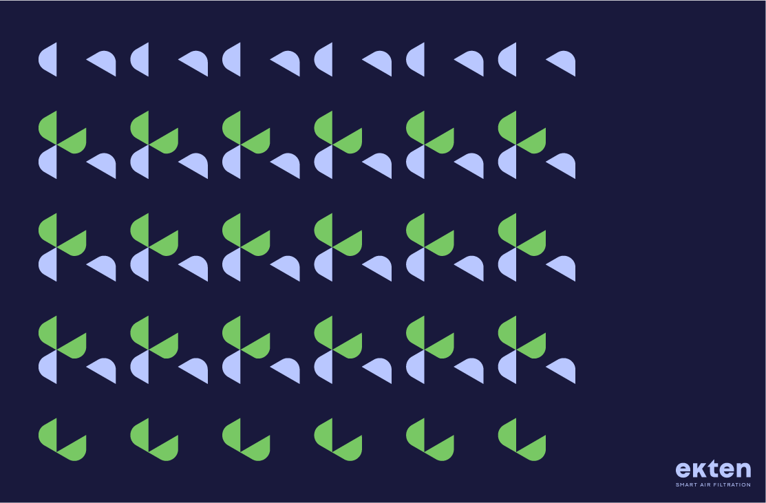
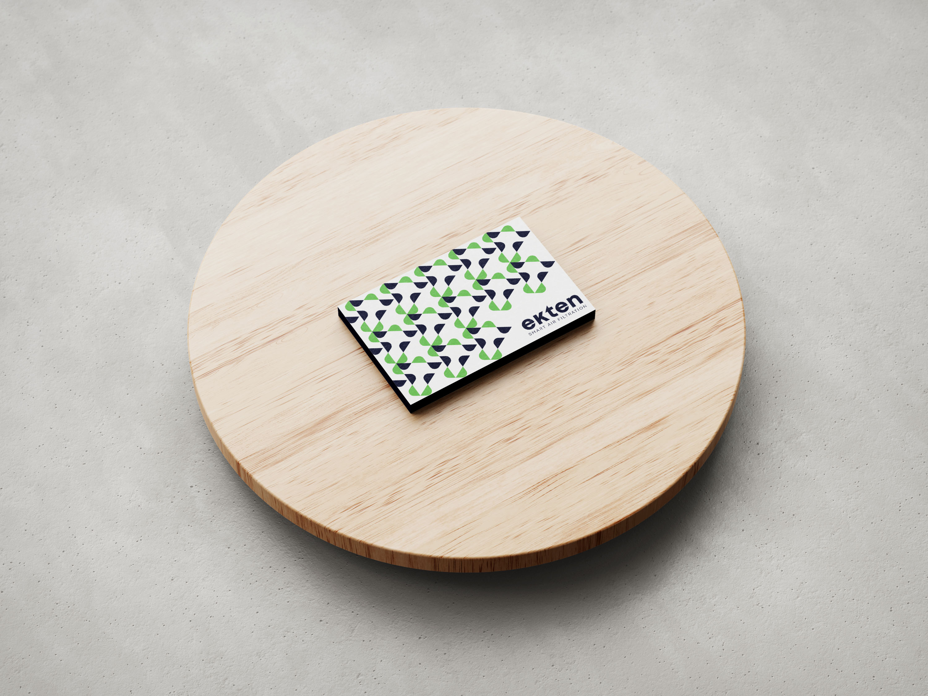
The visual system Strahinja developed is clean, confident, and engineered for flexibility. The logo is precise, its forms suggesting both the mechanical precision of industrial equipment and the organic flow of air. The typography is modern and legible, suitable for technical documentation and marketing materials alike. The color palette draws on associations with clean air and environmental responsibility—blues and greens that suggest clarity, freshness, and trust.
But the identity is more than aesthetics. It is a system designed to work across the full range of Ekten’s operations: from technical specifications and engineering drawings to marketing collateral and digital presence. The modular approach allows for adaptation across different media while maintaining consistency. A diagram in a technical manual and a banner on the website speak the same visual language, reinforcing the brand’s coherence.
The project also had to account for Ekten’s corporate culture. The company employs over 30 people, nearly a third of them engineers, and prides itself on custom solutions and personalized service. The identity needed to reflect this human dimension—to communicate that behind the technical expertise is a team of people committed to their clients’ success. The visual language balances precision with warmth, professionalism with approachability.
Ekten’s track record includes ISO 9001 certification and multiple Gold Business Excellence (AAA) awards, recognitions of quality and reliability. The identity needed to live up to this reputation, to convey the same confidence that has earned the company its place among Slovenia’s most trusted industrial partners. The final design is understated but authoritative, the kind of identity that wears well over time.
For Strahinja, the project was an opportunity to work at the intersection of industrial design and brand strategy. It required understanding not only visual language but also the technical and environmental contexts in which Ekten operates. The result is an identity that serves the company’s practical needs while also articulating its values: sustainability, innovation, reliability, partnership.
In the years since the project, Ekten has continued to grow, expanding its services and deepening its commitment to circular economy principles. The identity remains a foundation, a visual anchor for a company that is helping to shape a cleaner, more sustainable industrial future.