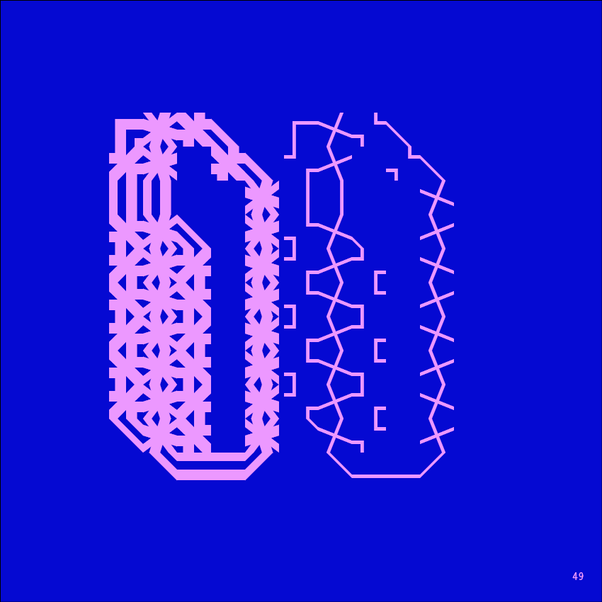
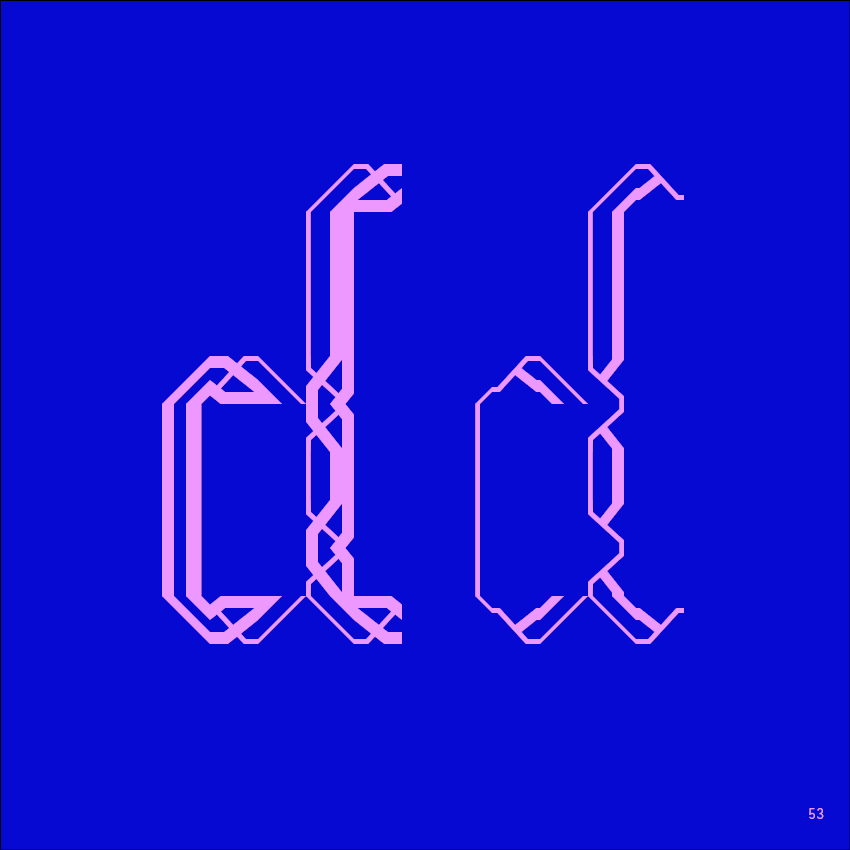
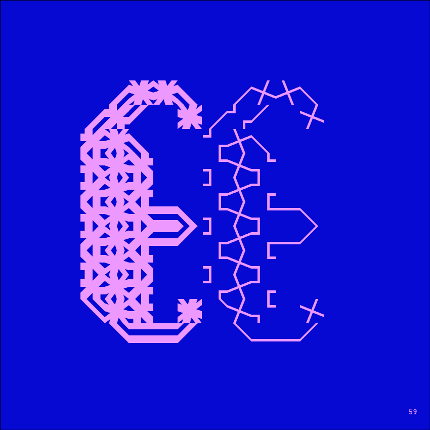
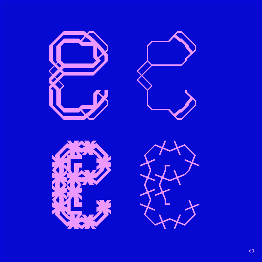
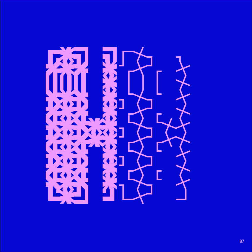
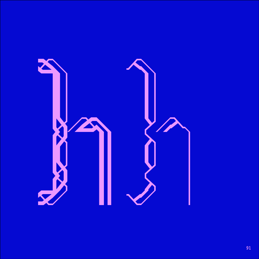
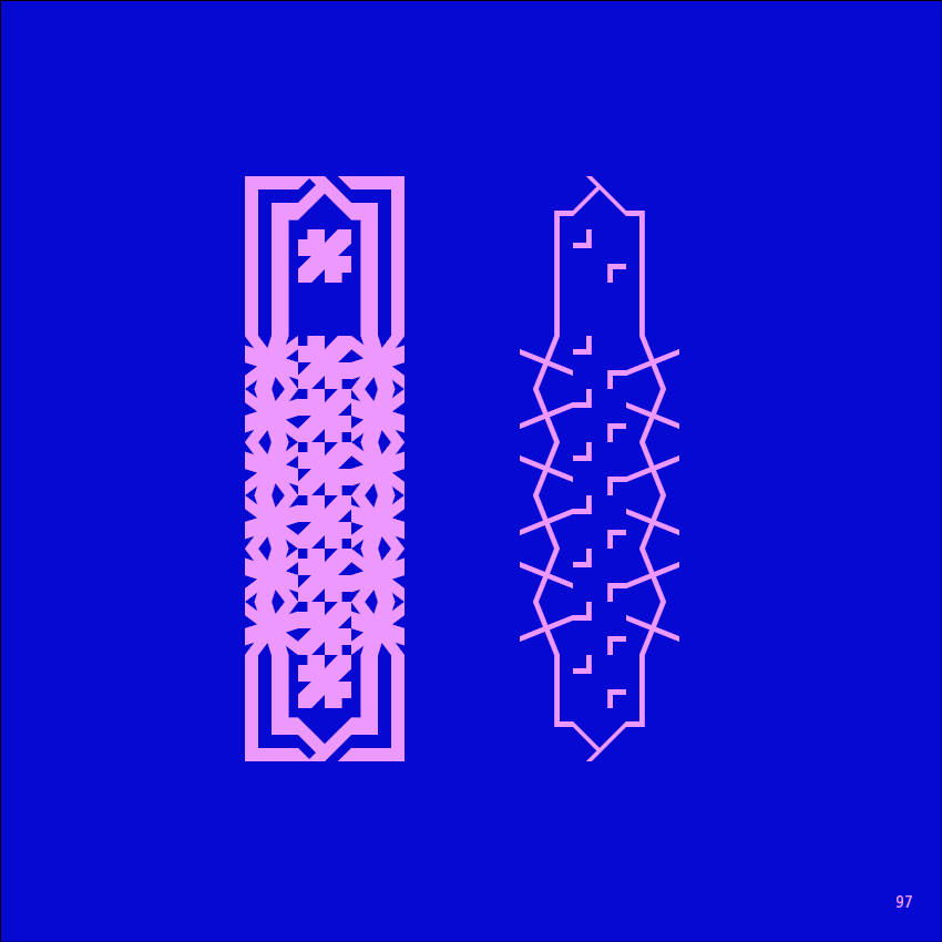
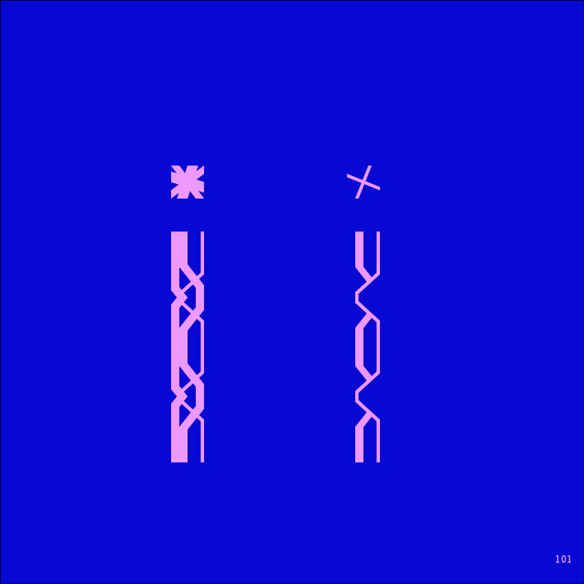
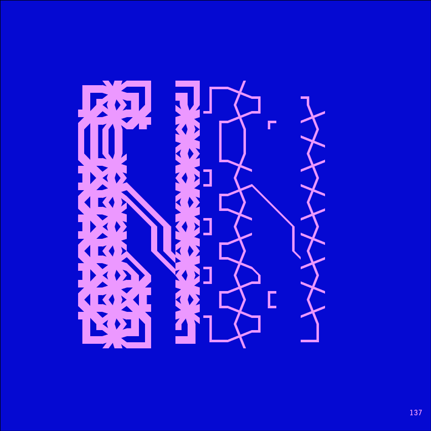
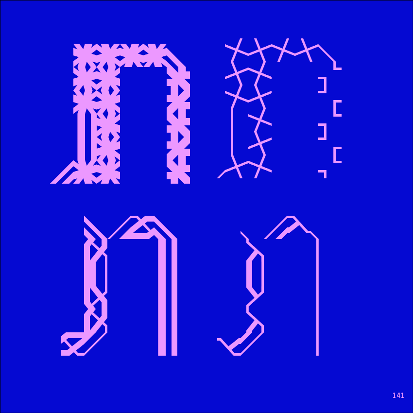
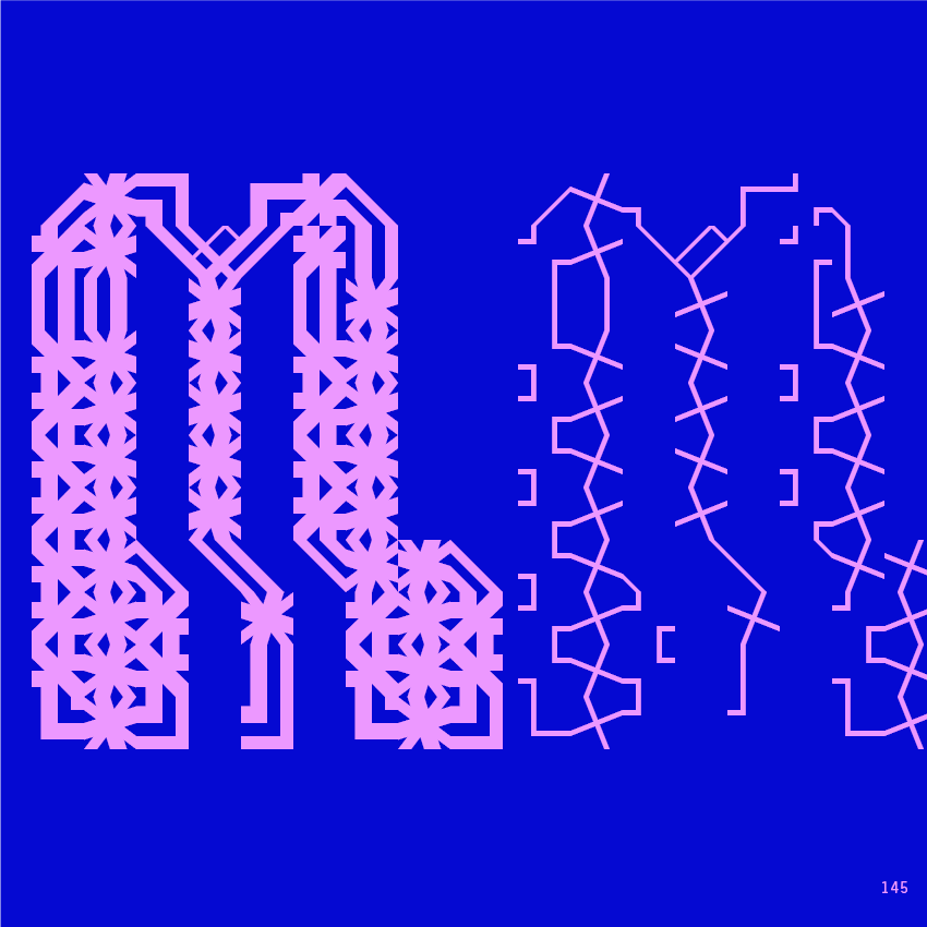
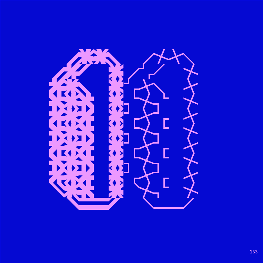
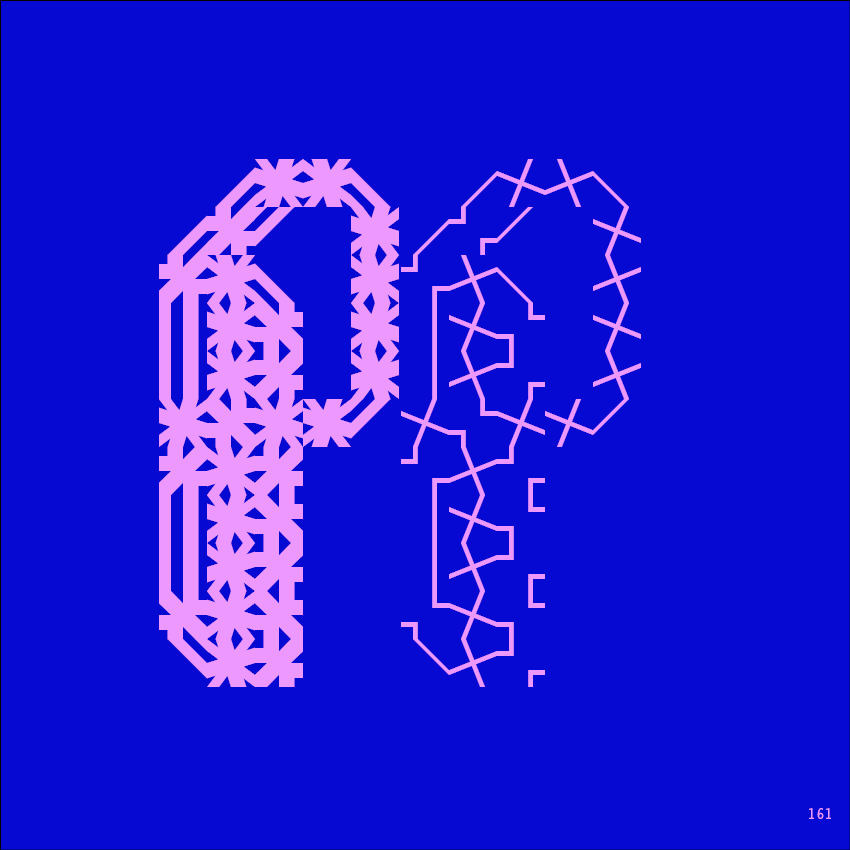
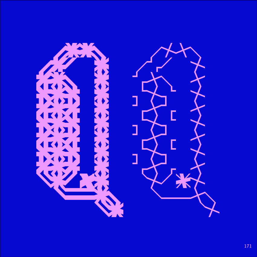
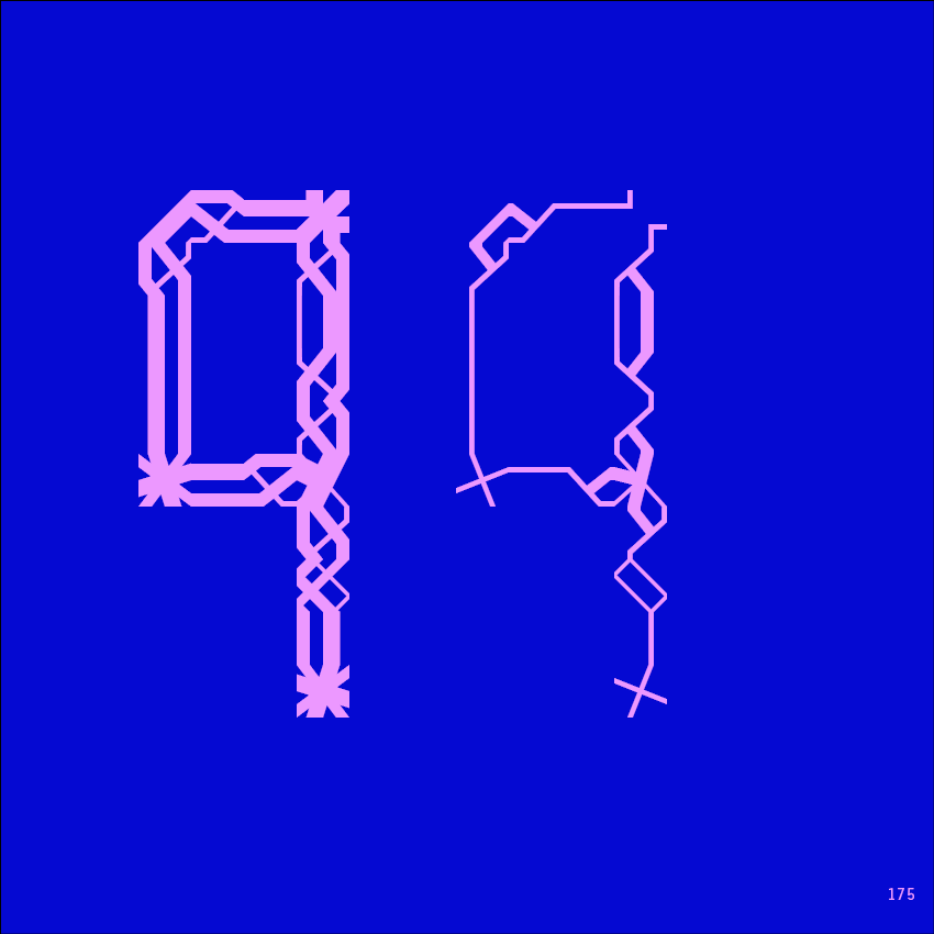
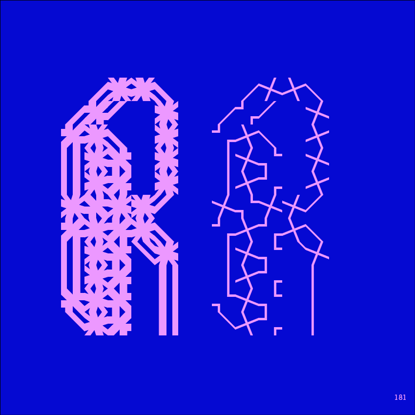
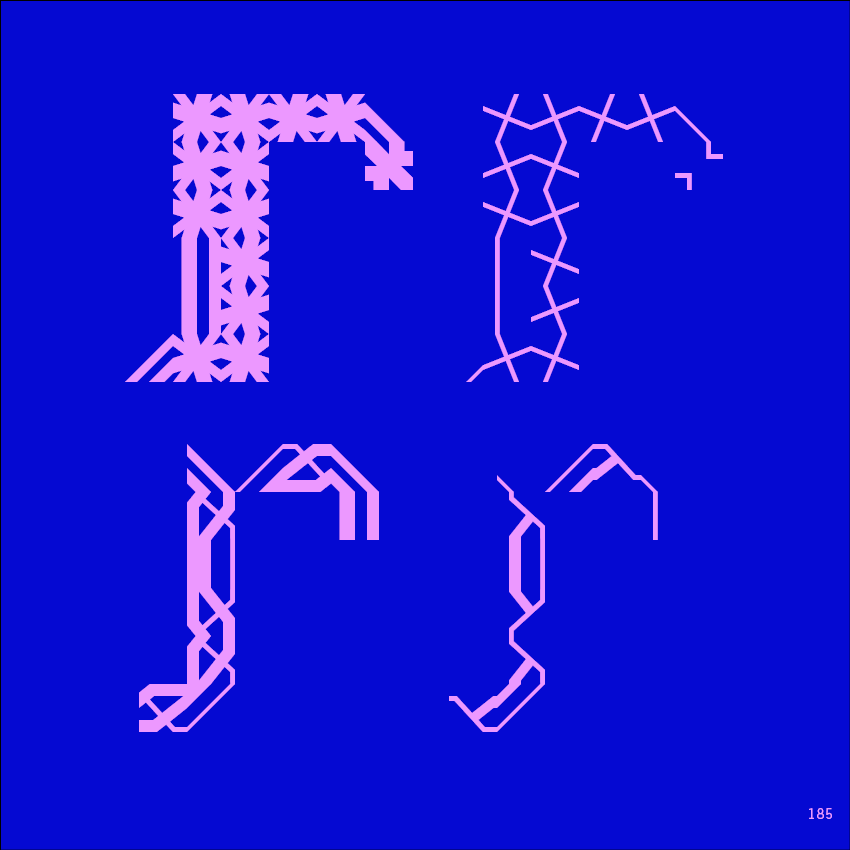
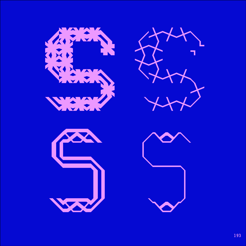
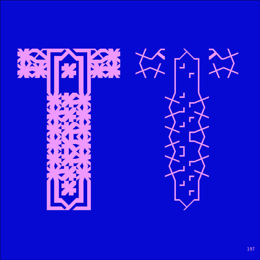
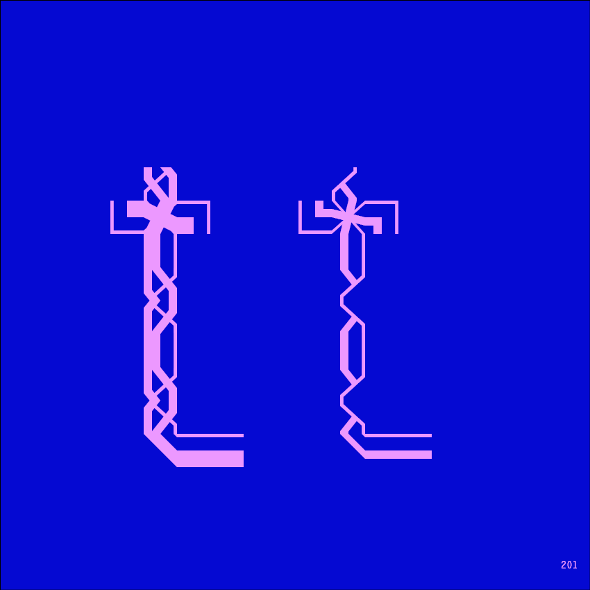
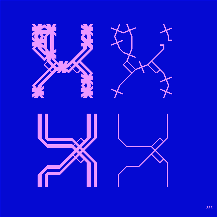
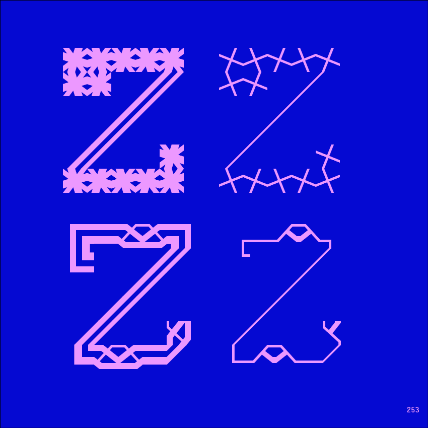
Mooresque Type transforms historical ornament into a modular typographic system. Each letter is built from elements—Alfa, Exo, ExoAlf—combining to create unique forms. Type becomes construction; ornament becomes language.
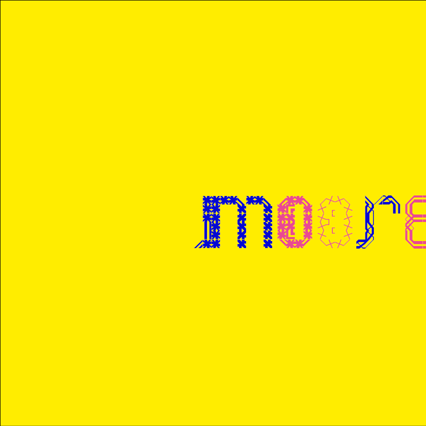
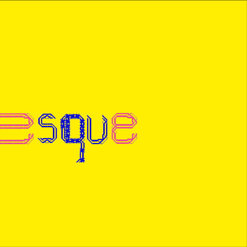
Not a font, but a toolkit. Mooresque Type offers modular elements that can be assembled into letters, each with its own weight, texture, character. The designer becomes a builder, constructing letters element by element.
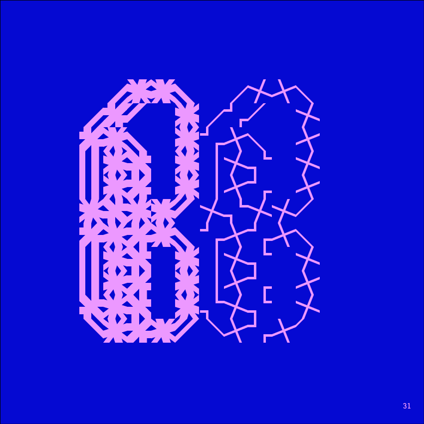
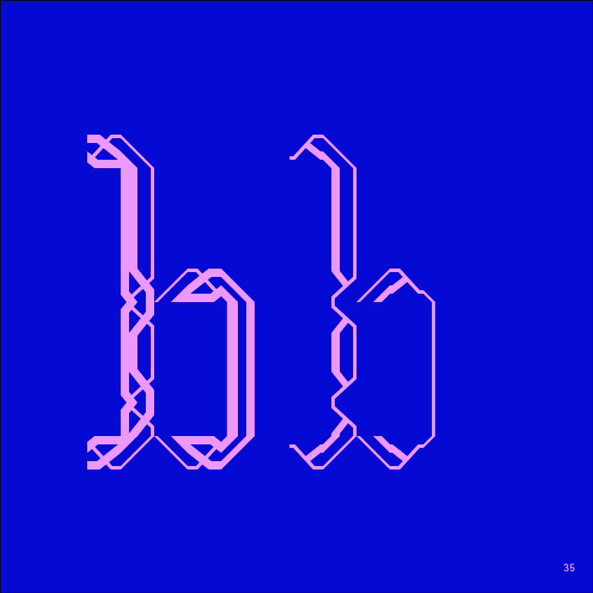
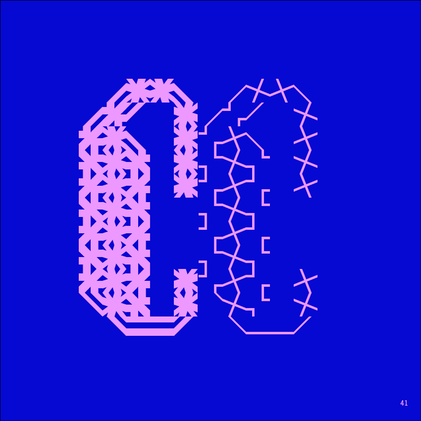
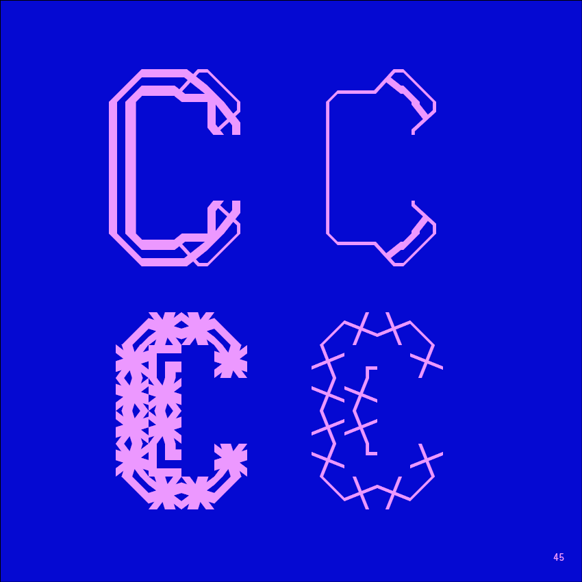
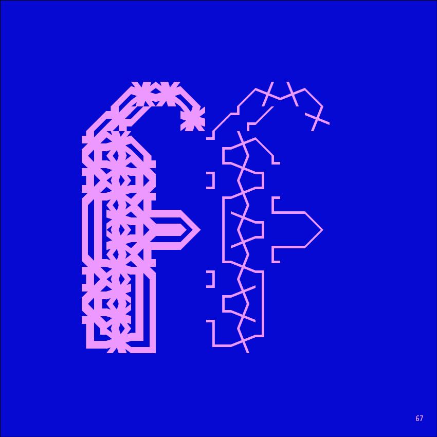
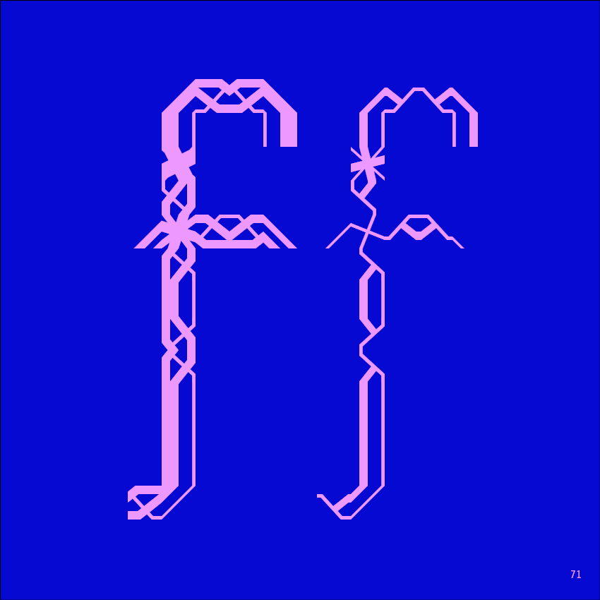
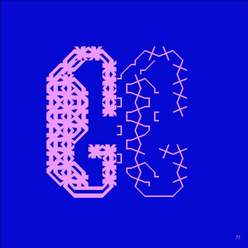
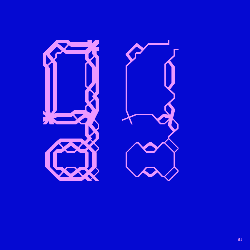

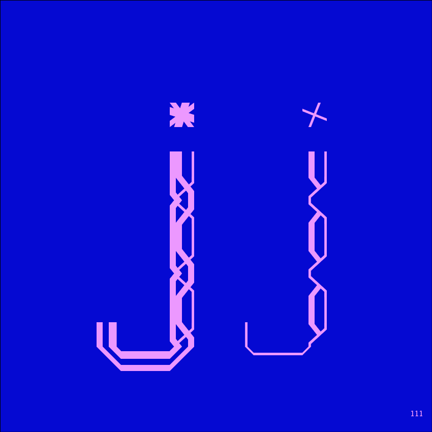
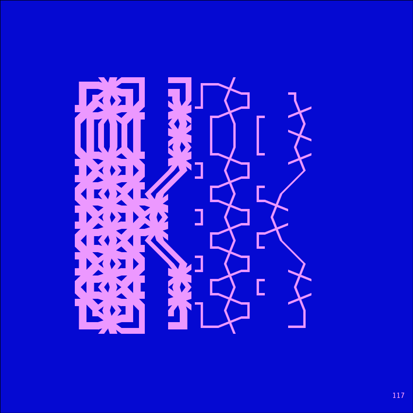
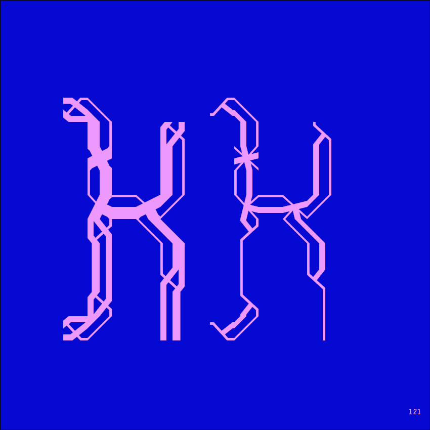
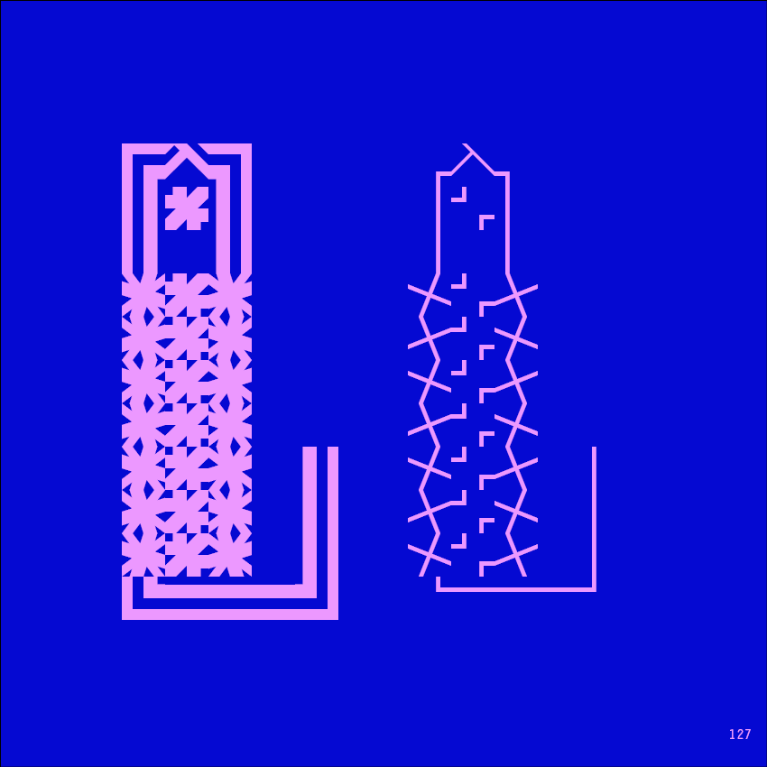
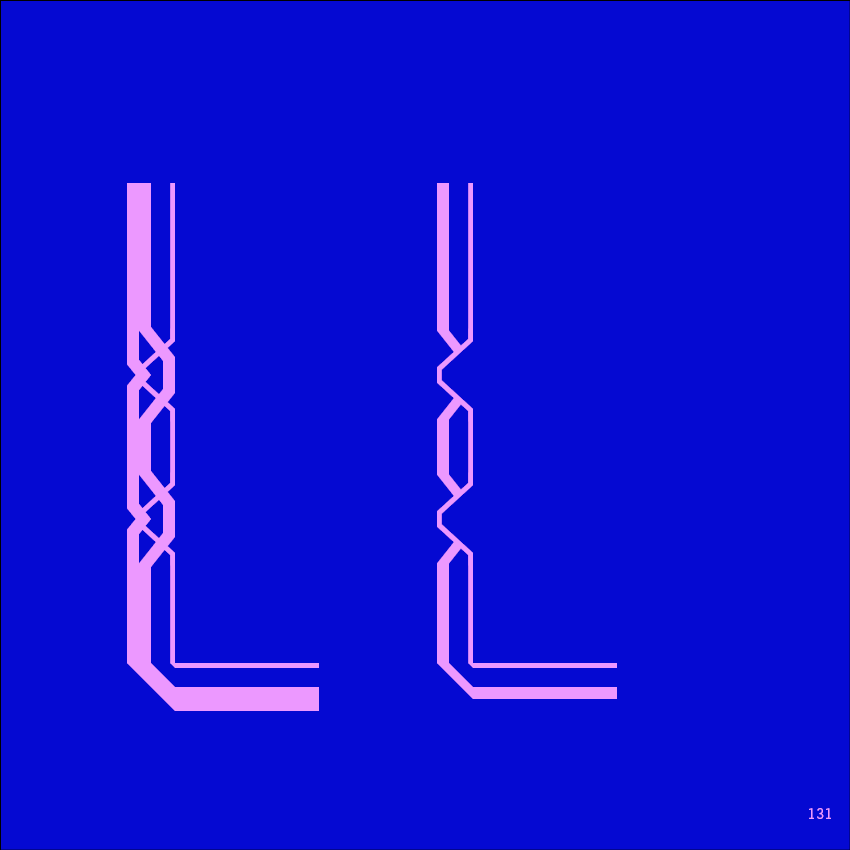
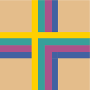
Inspired by 15th-century Moresque ornament, this modular system brings historical pattern into contemporary typography. Different thicknesses, different sizes, infinite combinations. A new way of writing, built from ornament.

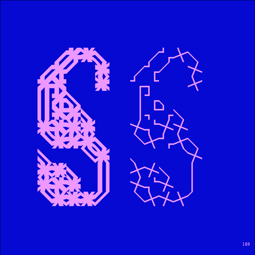
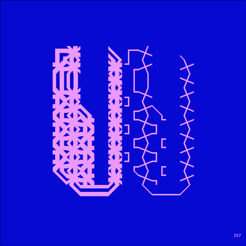
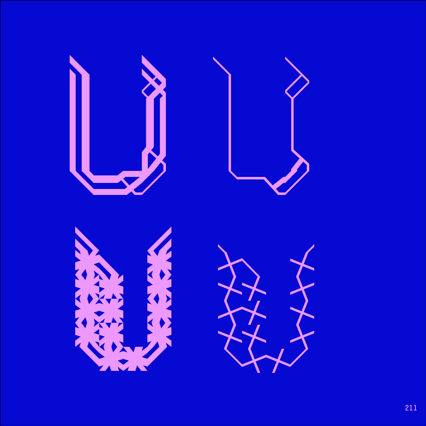

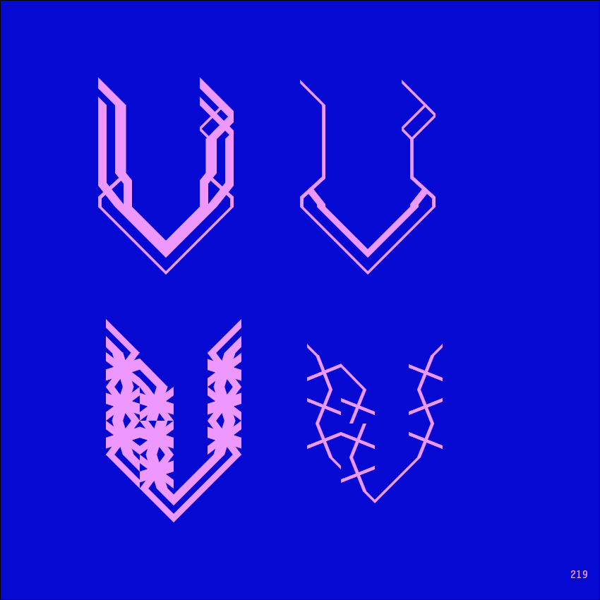
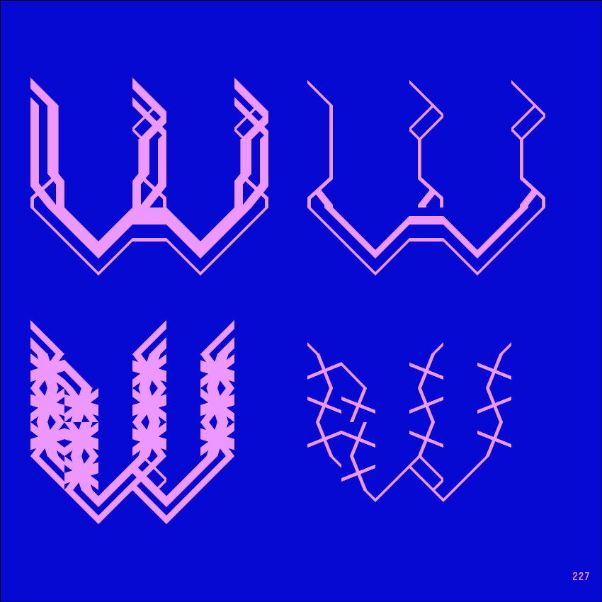
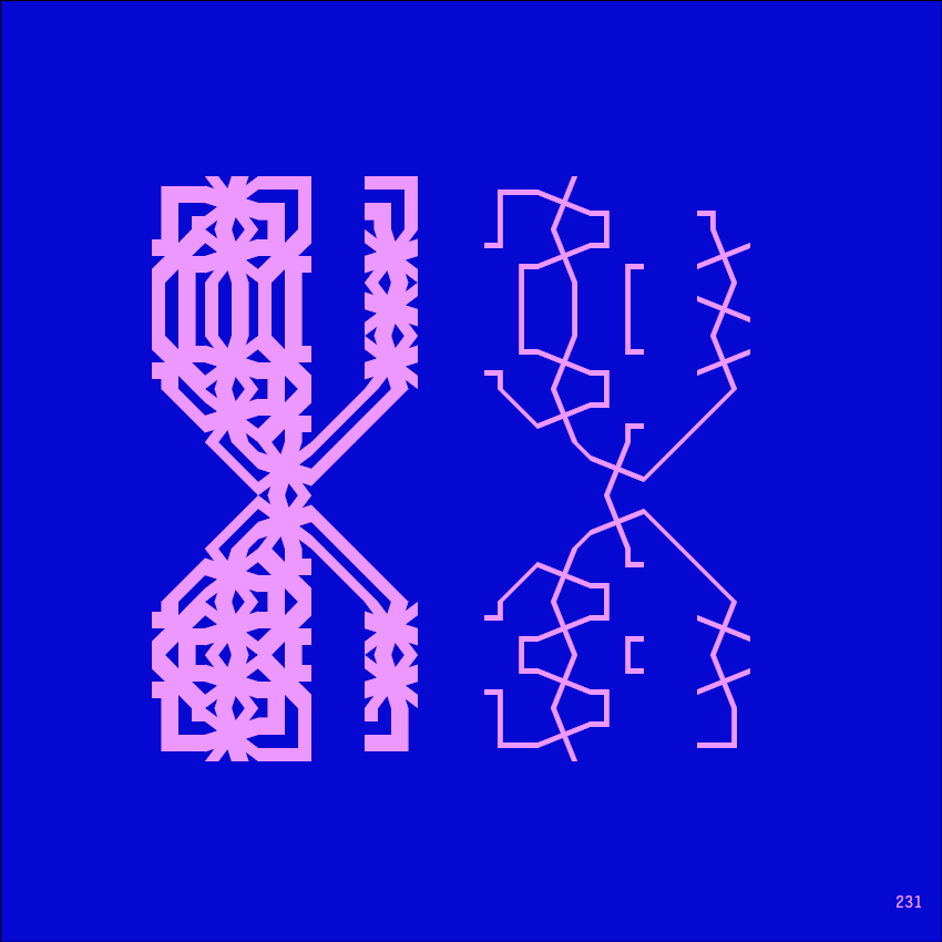
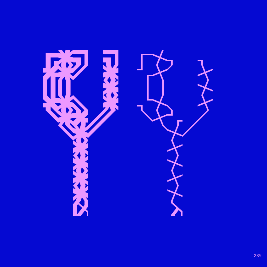
In the 15th century, Moresque ornament spread across Europe—intricate, interlacing, infinitely varied. It appeared in manuscripts, textiles, architecture, a visual language of pattern and repetition. Mooresque Type asks what happens when that ornamental language is applied to letters. The answer is a modular typographic system, a toolkit for building unique letterforms from a set of basic elements.
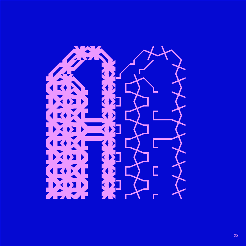
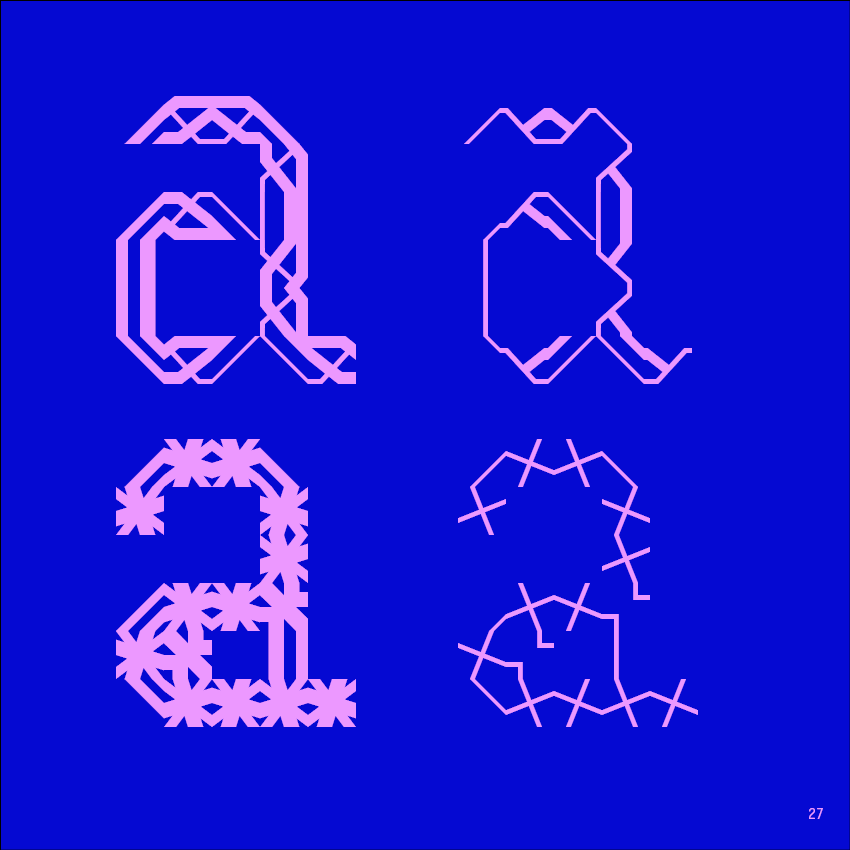
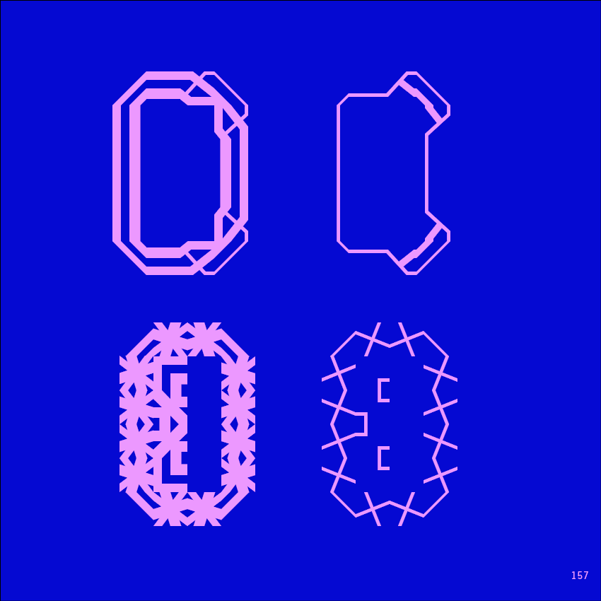
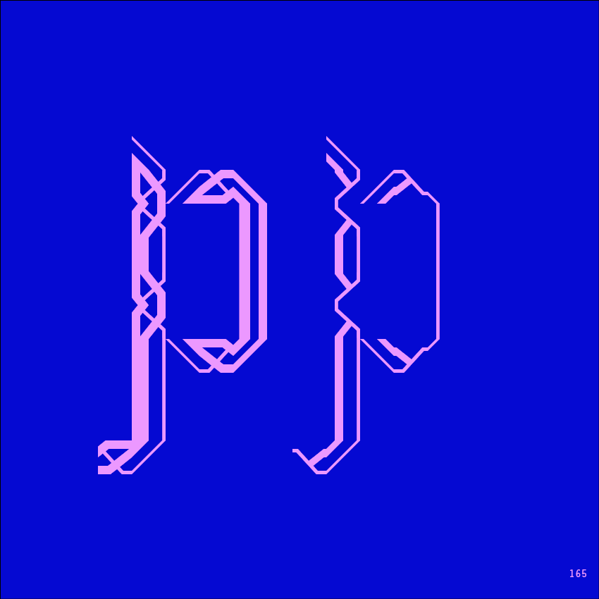
The system is built around three collections: ALFA MOORE, EXO MOORE, EXOALF MOORE. Each is a set of modular elements—shapes, strokes, forms—that can be combined, repeated, transformed. The elements are inspired by Moresque ornament but not bound by it; they are tools for construction, not reproductions of historical forms. The user selects elements, assembles them, builds letters. Each letter becomes a unique composition, a product of choice and arrangement.
The modular approach is central to the project's identity. Traditional typefaces fix letters in predetermined forms; Mooresque Type generates them in the moment of making. The designer is not a typographer selecting from a menu but a builder, assembling elements into letters. Different thicknesses produce different weights; different combinations produce different characters. The system is precise but open, structured but generative.
The name Mooresque Type signals its dual heritage. "Mooresque" refers to the ornamental tradition that inspired the work; "Type" refers to the letters it produces. Together, they suggest a synthesis: ornament as the basis for typography, pattern as the foundation for legibility. The letters are not stripped of decoration; they are built from it.
The project reflects a broader interest in modular design that runs through Strahinja Jovanović's work. In Orthoments, modular ornaments became type; in Neue Modulo, modular strokes became calligraphy; in Folium, the Fibonacci sequence shaped letterforms. Mooresque Type continues this inquiry, exploring how letters can be built from parts, how parts can generate infinite variation, how construction can be a form of expression.
The elements themselves are carefully designed. They are not arbitrary; each has been shaped to connect with others, to combine in predictable ways, to produce forms that are both ornamental and legible. The system allows for different thicknesses, different sizes, different arrangements. A letter can be bold or light, condensed or expanded, depending on how its elements are chosen and combined. The designer is in control, but the system guides.
Mooresque Type is not a font in the traditional sense. It does not offer a fixed set of letterforms; it offers a method. The user does not type; they build. The result is typography that is always unique, always specific to its maker, always a product of the choices made in its construction.
For Strahinja, the project is an exploration of what typography can be when it is understood as construction rather than selection. It asks us to consider letters not as given but as made, not as inherited forms but as opportunities for design. It is a toolkit for thinking about type, a system for building meaning from ornament, a way of writing that is also a way of making.
In the end, Mooresque Type is about possibility. The elements are finite; the combinations are not. Each letter is a new construction, each text a new arrangement. It is typography as play, as exploration, as the endless recombination of a few basic forms.
.jpg)
.gif)