Psychologist Robert Plutchik assigned colors to emotions—deeper hues for stronger feelings. Data Paintings reimagines his wheel using data from 4,105 artworks. Paintings that evoked specific emotions were pixel-sorted into gradients, creating a new kind of emotional palette.
.gif)
Focusing on color field painting, where color carries emotional weight, the project extracts the top ten paintings for each emotion and pixel-sorts them into gradients. The result is a visualization of how art moves us—at scale.
Created by Strahinja Jovanović and Sheung Yiu, Data Paintings sits at the intersection of art, psychology, and computation. It asks: what do 4,105 paintings tell us about how color communicates emotion?
In 1958, psychologist Robert Plutchik proposed a model for understanding human emotion. His emotion wheel arranged feelings in a circular structure, with adjacent emotions blending into one another and deeper colors representing more intense experiences. Plutchik’s wheel was a theoretical framework—a map of the inner world, rendered in color and form.
In 2021, Strahinja Jovanović and Sheung Yiu asked what that map might look like if it were built not from theory but from data. Their project, Data Paintings, reimagines Plutchik’s emotion wheel using the WikiArt Emotion Dataset, a collection of 4,105 artworks rated by participants on the emotions they evoke. The result is a new kind of visualization: part data analysis, part color study, part reflection on how art moves us.
The project focuses on non-black-and-white paintings, with particular attention to color field painting—a movement in which color itself carries the emotional weight. In works by artists like Mark Rothko, Barnett Newman, and Helen Frankenthaler, color is not decoration but content; it is meant to be felt. Data Paintings takes this premise and scales it, asking: what do thousands of paintings tell us about the relationship between color and emotion?
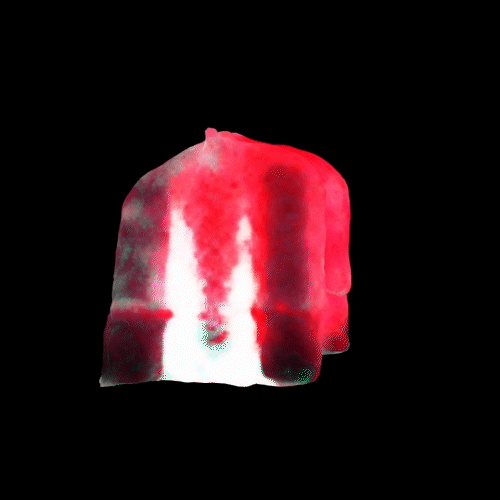
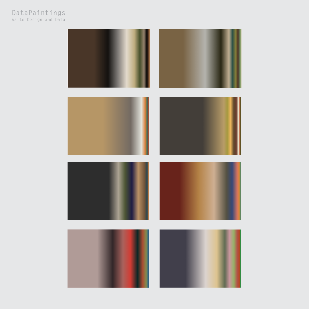
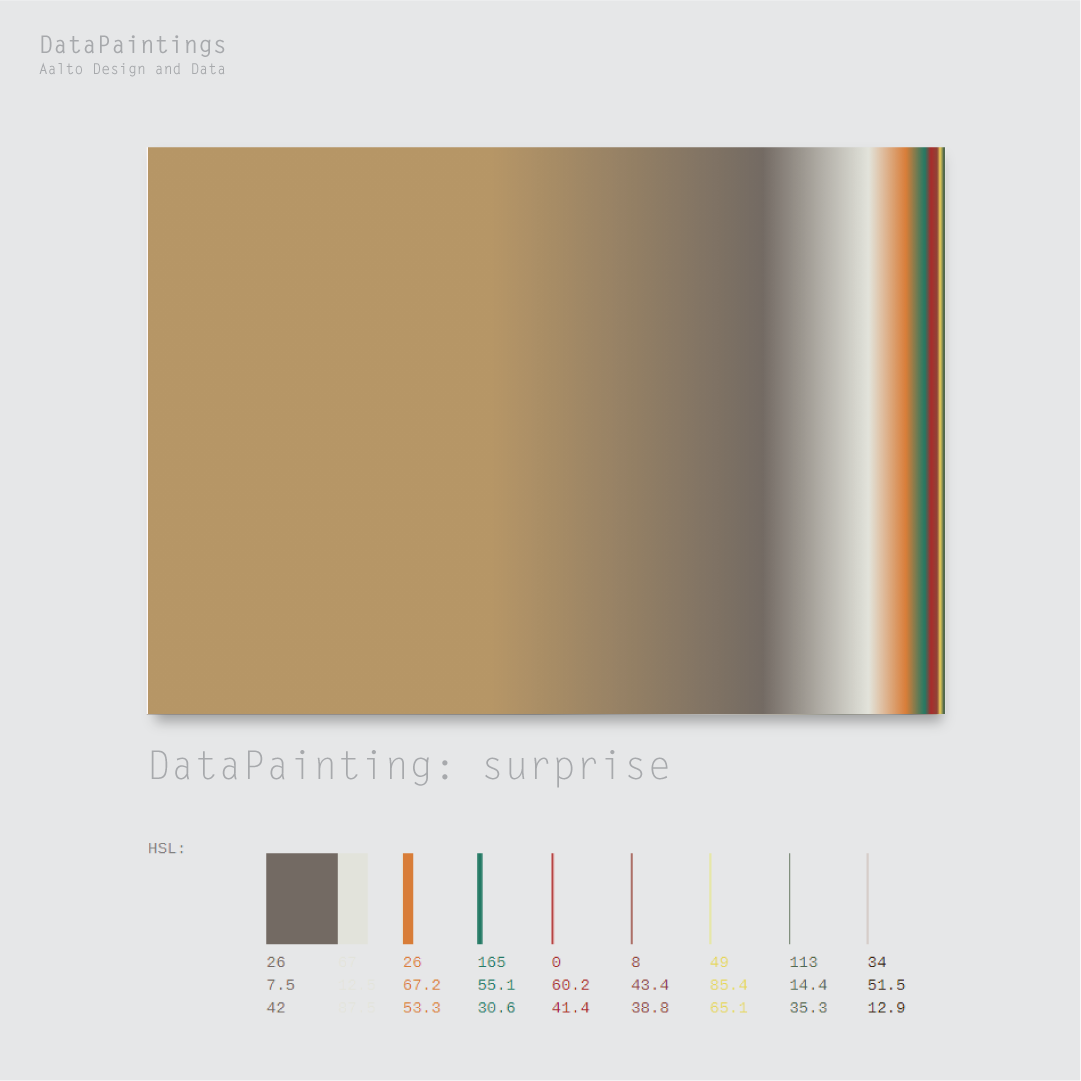
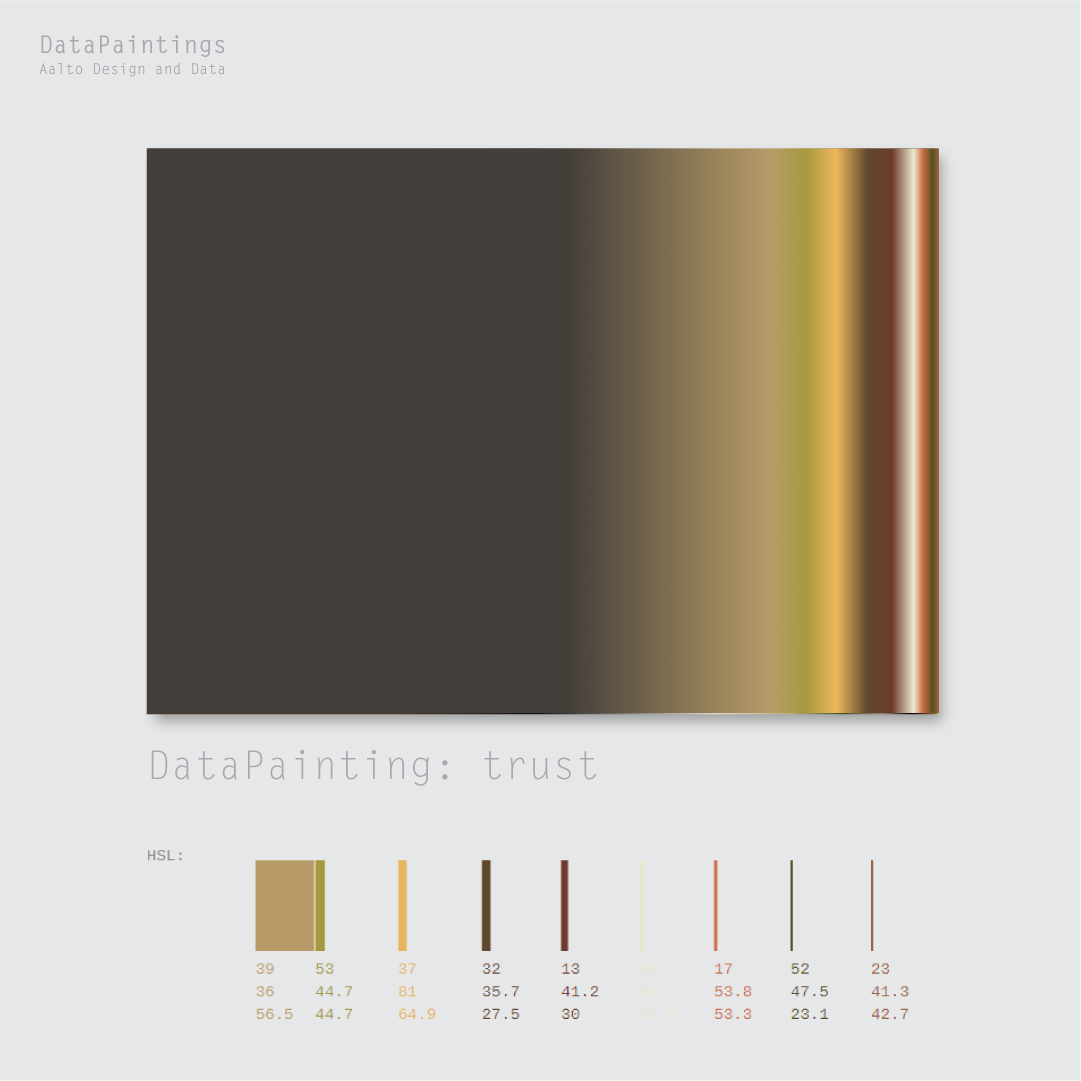
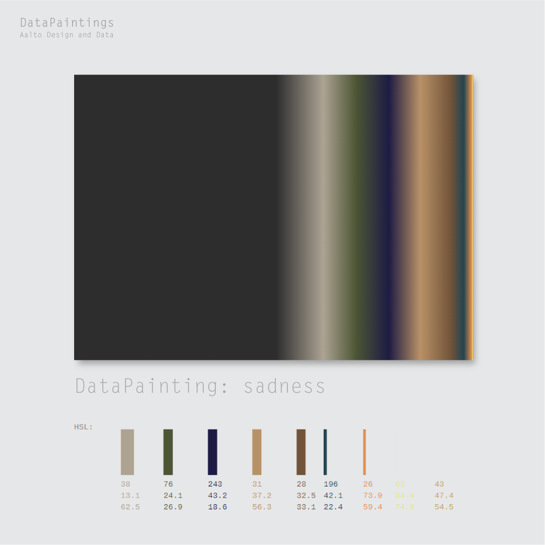
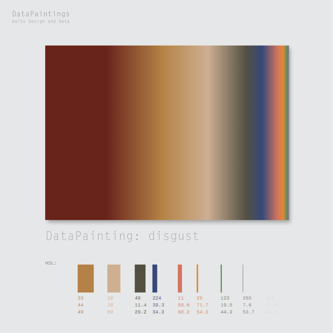
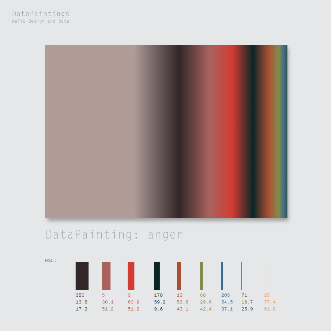
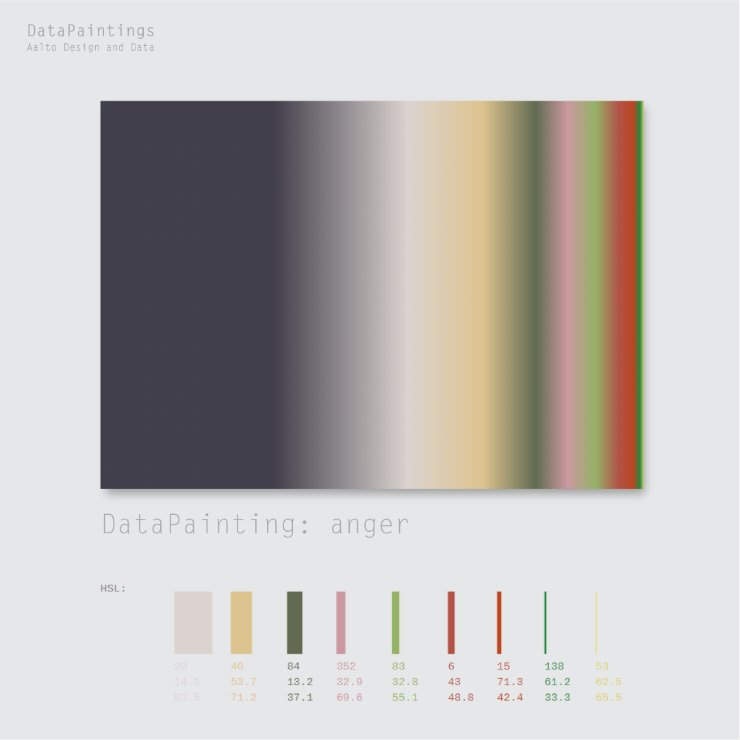
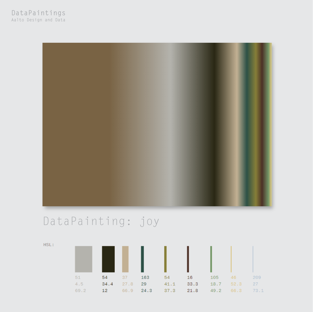
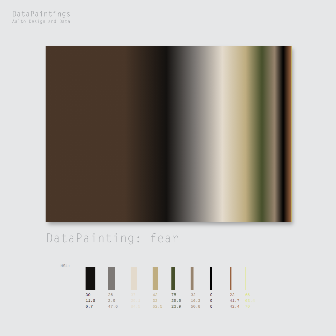
The method is elegant. For each emotion category in Plutchik’s wheel—joy, trust, fear, surprise, sadness, anticipation, anger, disgust—the researchers identified the ten paintings that received the highest ratings for that emotion. These paintings were then pixel-sorted, a computational technique that rearranges the pixels of an image by color value, creating gradients that strip away representational content and leave only the underlying palette. The result is a series of gradients, each one a distillation of the colors that, according to human raters, evoke a specific emotion.
The gradients are then arranged in a wheel, mirroring Plutchik’s original structure. But where Plutchik’s wheel was based on theory, this one is based on experience—on the aggregated responses of hundreds of participants, on the emotional resonance of actual artworks, on the messy, irreducible relationship between color and feeling.
The project is a collaboration between two designers working at the intersection of art, data, and computation. Strahinja’s background in graphic design and mathematics, combined with Sheung Yiu’s expertise in computational methods, allowed them to approach the question from multiple angles. The work is both rigorous and poetic—grounded in data, yet open to interpretation.
Data Paintings raises questions about how we understand emotion, how we quantify the unquantifiable, how we translate subjective experience into visual form. It does not claim to have found definitive answers. Instead, it offers a method, a way of seeing, a provocation. The gradients are beautiful, but they are also traces of something larger: the cumulative response of thousands of viewers to thousands of artworks, distilled into color.
In the end, Data Paintings is a meditation on the relationship between art and emotion, between theory and data, between the individual experience of a painting and the collective experience of many. It is a reminder that color is not merely visual but visceral, that emotion can be studied but not reduced, that the wheel of feeling is always in motion.
.gif)