The identity for the European Team Chess Championship captures the flow of figures across the board. Inspired by movement and strategy, a modular visual language transforms chess pieces into dynamic patterns—capturing the game's elegance and intensity.

Chess is a game of infinite combinations. This identity mirrors that logic: a modular system of forms that can be arranged, repeated, and reconfigured. The result is a visual language as flexible as the game itself.

.png)
%20Preview%2021.09.png)
-Preview-20.png)
Watching chess, you see not only pieces but movement—strategy unfolding in space. This identity translates that flow into pattern, creating a visual system that speaks to the rhythm, tension, and beauty of the game.
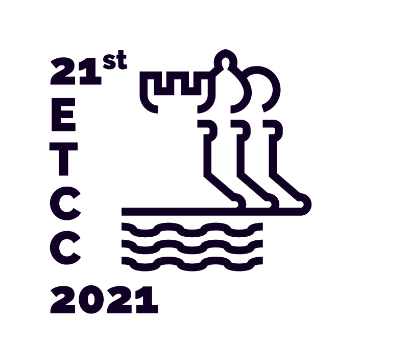


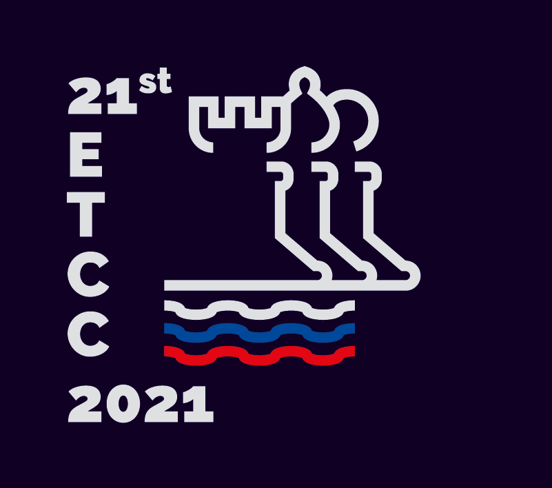
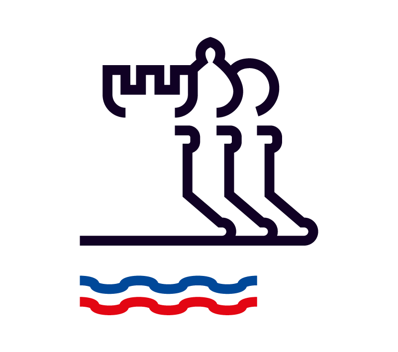
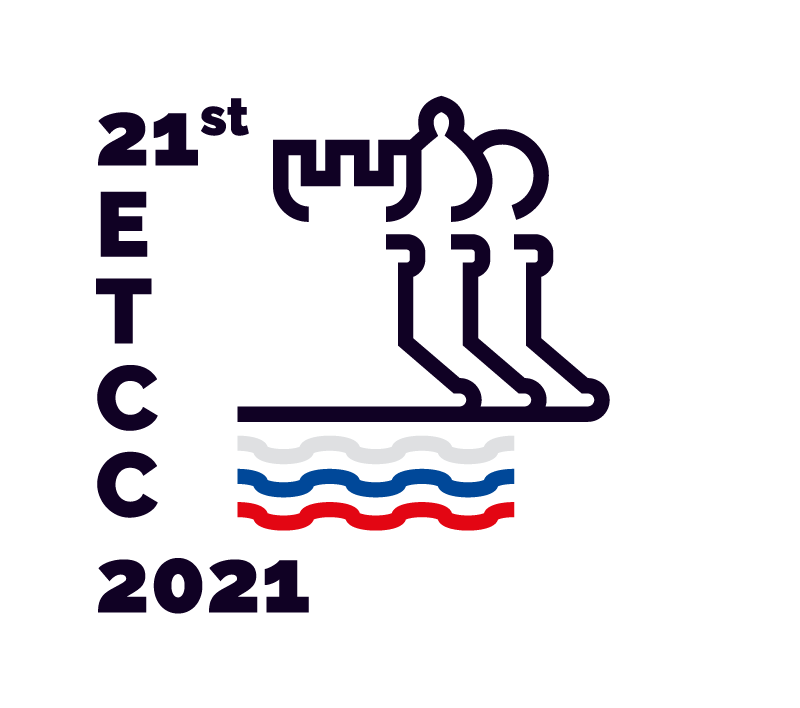
In 2021, Slovenia hosted the 21st European Team Chess Championship, a gathering of the continent’s finest players. For the event, Strahinja Jovanović developed a visual identity that sought to capture something essential about the game: not only its pieces and their movements, but the quality of flow that emerges from them.
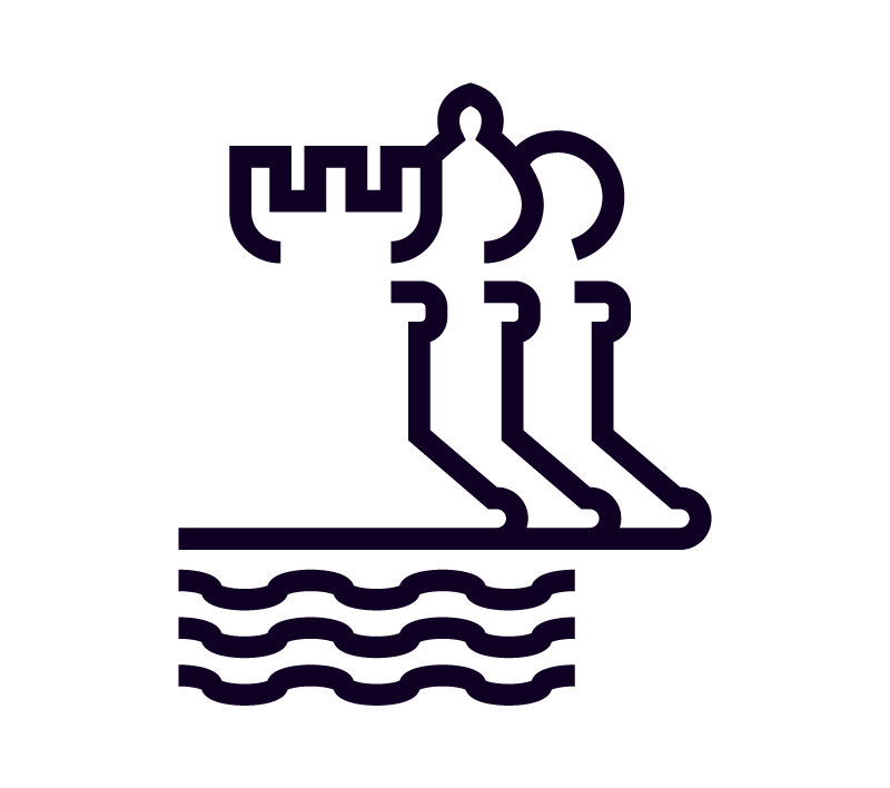
Chess is often understood as a game of static elements—the board, the pieces, the positions. But anyone who watches chess closely knows that it is also a game of motion. Pieces move, strategies shift, the balance of power flows from one side of the board to the other. There is a rhythm to it, a kind of visual music. Strahinja’s identity for the championship aimed to translate this quality into visual form.
The approach was modular. Rather than creating a single, fixed logo, Strahinja developed a system of forms that could be arranged, repeated, and reconfigured—much like the pieces on a chessboard. These forms were inspired by the shapes of the pieces themselves, but also by their movements: the diagonal glide of the bishop, the orthogonal thrust of the rook, the knight’s unpredictable leap. In the identity, these movements become patterns, interlocking and overlapping, creating a visual language that is both structured and fluid.
The modularity of the system is key. Just as a chess game can unfold in countless ways depending on the players’ choices, the identity can generate countless variations depending on how the elements are combined. This flexibility allows the visual language to adapt across applications: a poster might use one pattern, a program another, a digital banner another still. Yet all remain recognizably part of the same family, held together by the logic of the system.
The color palette draws on the classic chessboard—black and white—but introduces accents of red and gold, evoking the prestige of the championship. The typography is clean, modern, unafraid of white space, allowing the patterns to do their work. The overall effect is one of clarity and energy: an identity that is unmistakably about chess, but also about movement, about play, about the beauty of strategy unfolding.
For Strahinja, the project was an opportunity to explore the relationship between structure and expression. Chess is a game of rules, but within those rules, infinite possibility. The identity mirrors this: a rigorous modular system that produces rich variation. It is a visual language that rewards close looking—pattern within pattern, movement within stillness—much like the game itself.
The identity was used across the championship: on posters, programs, banners, digital media. It helped give the event a unified visual presence, but more than that, it offered a way of seeing chess differently. Not as a grid of static positions, but as a field of forces in motion. Not as a game of pieces, but as a game of flows.
In the end, Sah Zveza is a reminder that identity design can be more than representation. It can be interpretation. It can find, in a game played for centuries, something new to say about movement, strategy, and the forms that emerge from constraint.


.gif)