Megafon is a bold, expressive typeface designed to amplify voices in protest. Drawing visual language from the megaphone as a symbol of collective speech, the letterforms convey urgency, power, and the raw energy of public declaration.
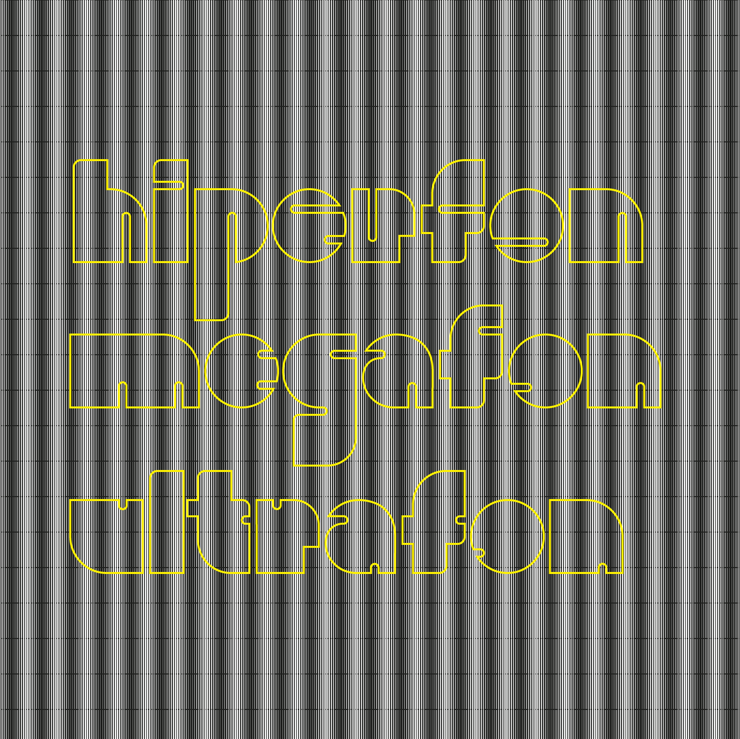

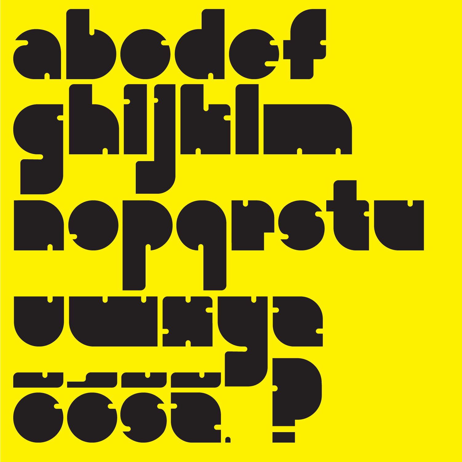
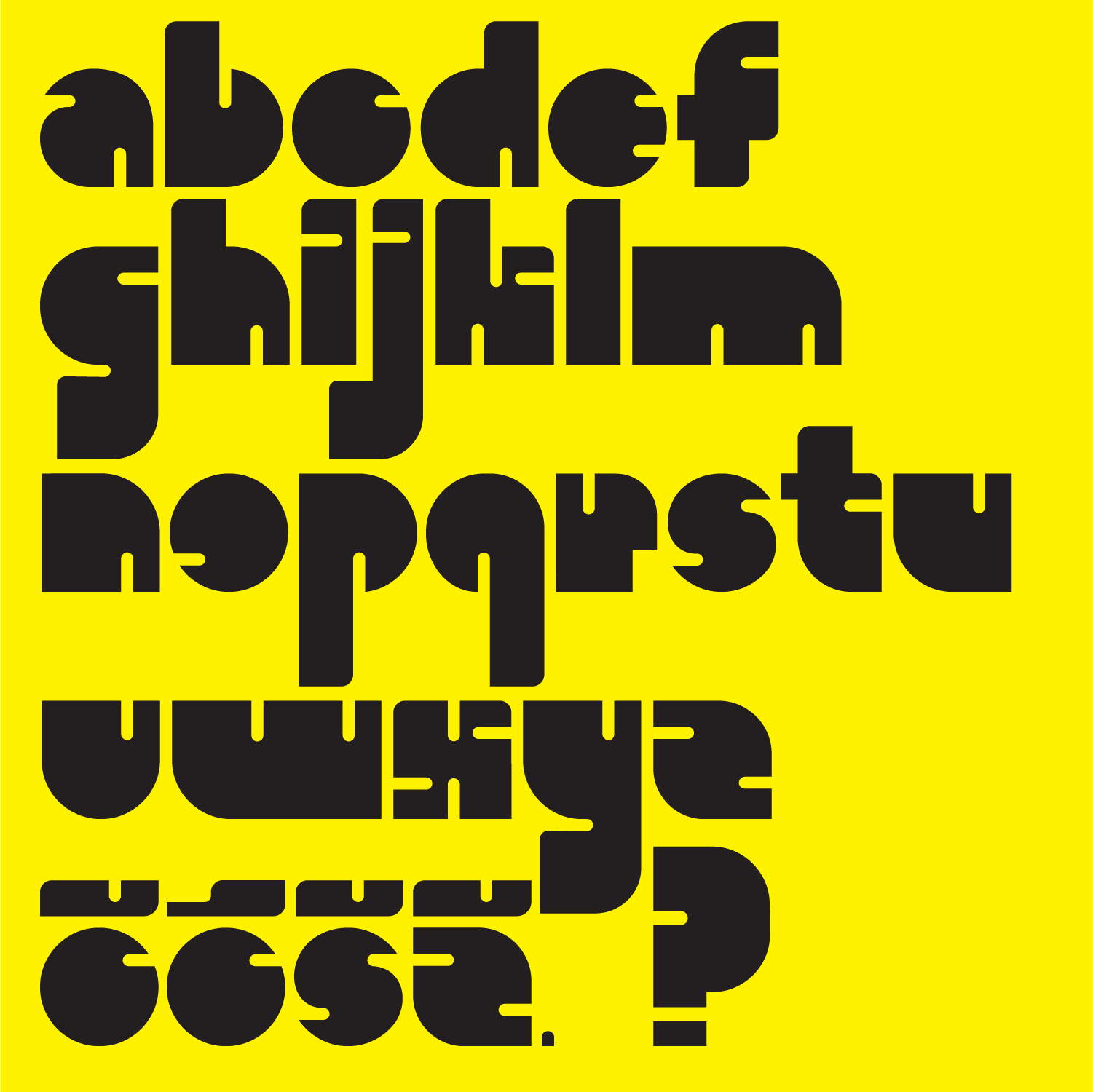
Each character in Megafon echoes the form of a megaphone—wide-mouthed, expansive, projecting outward. The typeface translates the physical act of shouting into visual form, creating letterforms that feel both vocal and visceral.


More than a functional typeface, Megafon explores typography’s role in social movements. Designed at the Academy of Fine Arts and Design, it asks: how can letters themselves become tools for speaking truth to power?

What does protest look like in letters? This is the question at the heart of Megafon, a bold, expressive typeface created by Strahinja Jovanović at the Academy of Fine Arts and Design in 2022. The project began with a simple but powerful inquiry: how can we design a typeface that speaks—not just legibly, but with the urgency, volume, and collective force of a protest?
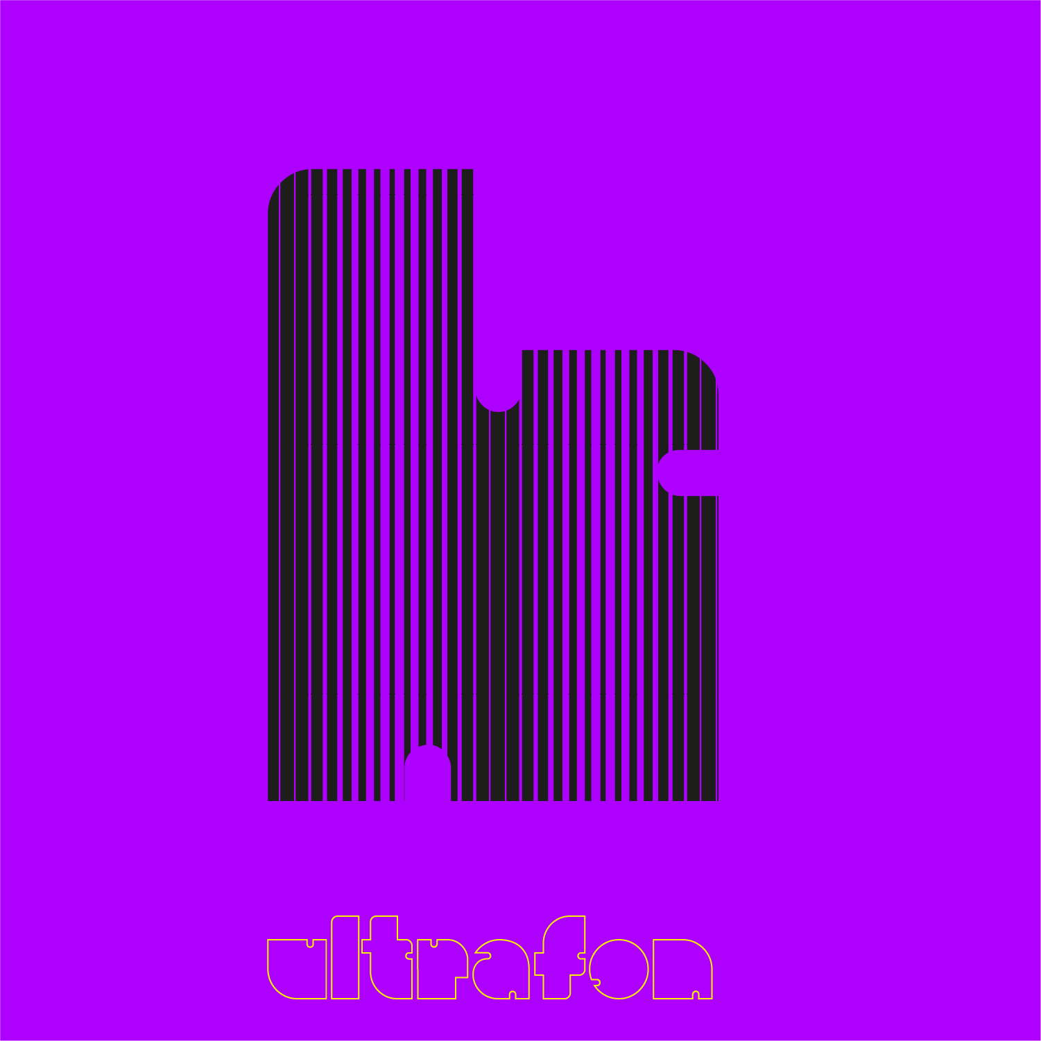
The answer lies in the symbol of the megaphone. As an object, the megaphone has long represented the act of speaking out, of gathering people, of projecting a voice beyond its natural reach. It is the tool of activists, orators, and revolutionaries. Megafon translates this object into letterforms, creating a typeface that visually echoes the megaphone’s distinctive shape—wide-mouthed, expanding outward, designed to be seen and heard from a distance.
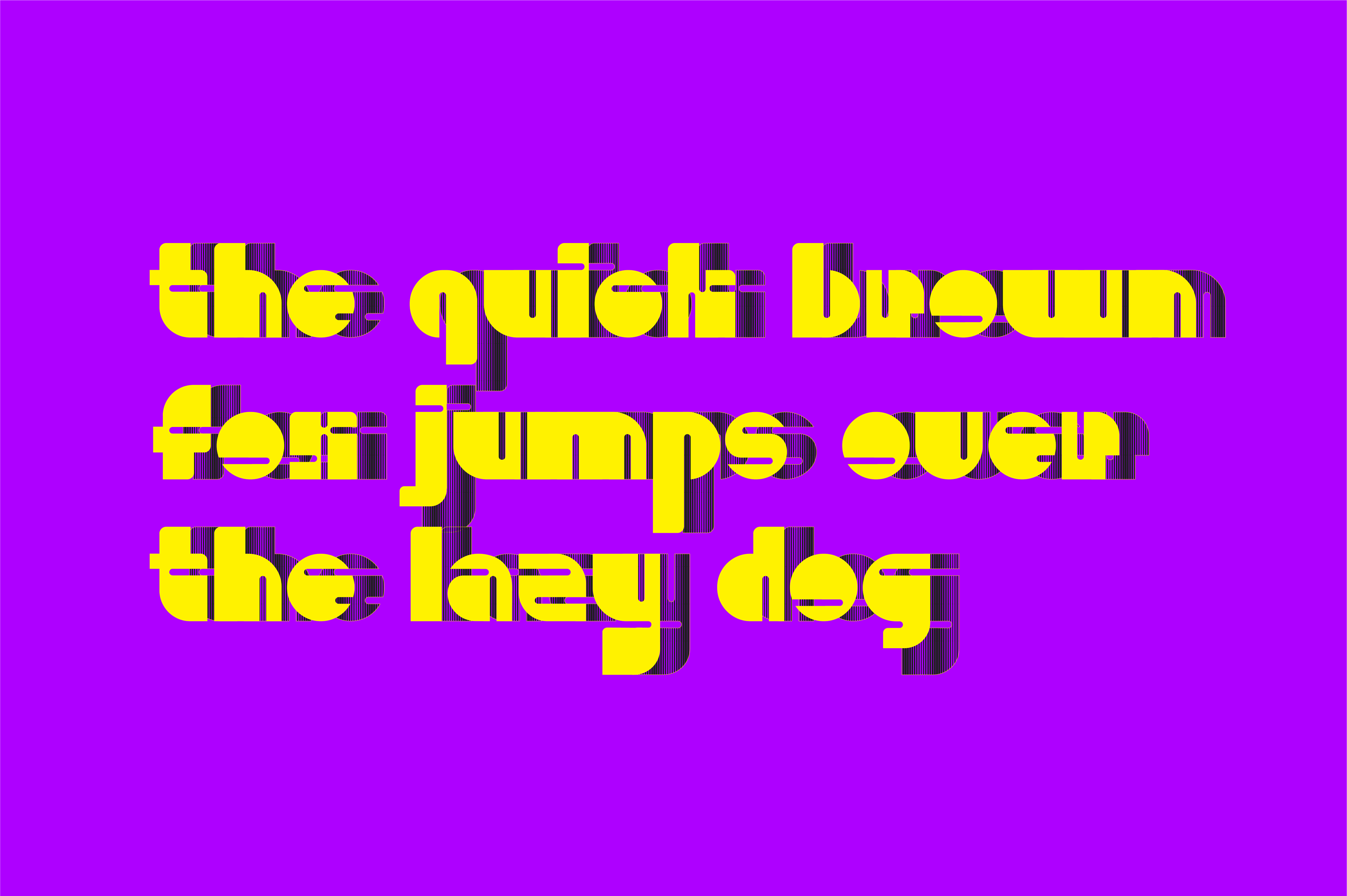
Each character in Megafon is constructed with a sense of outward projection. Ascenders flare like the bell of a megaphone; descenders anchor the letters with weight and stability. The forms are bold, almost aggressive in their presence, yet there is a rhythmic quality that makes them feel organic rather than mechanical. The typeface does not simply convey words—it performs them, embodying the act of speaking itself.
The design process behind Megafon was rooted in both formal typographic principles and conceptual inquiry. Strahinja explored the relationship between form and meaning, asking whether a letterform could carry emotional and political weight independent of the words it spells. He looked at historical protest graphics, from early twentieth-century agitprop to contemporary activist signage, drawing inspiration from the ways typography has been used to mobilize communities and articulate dissent.
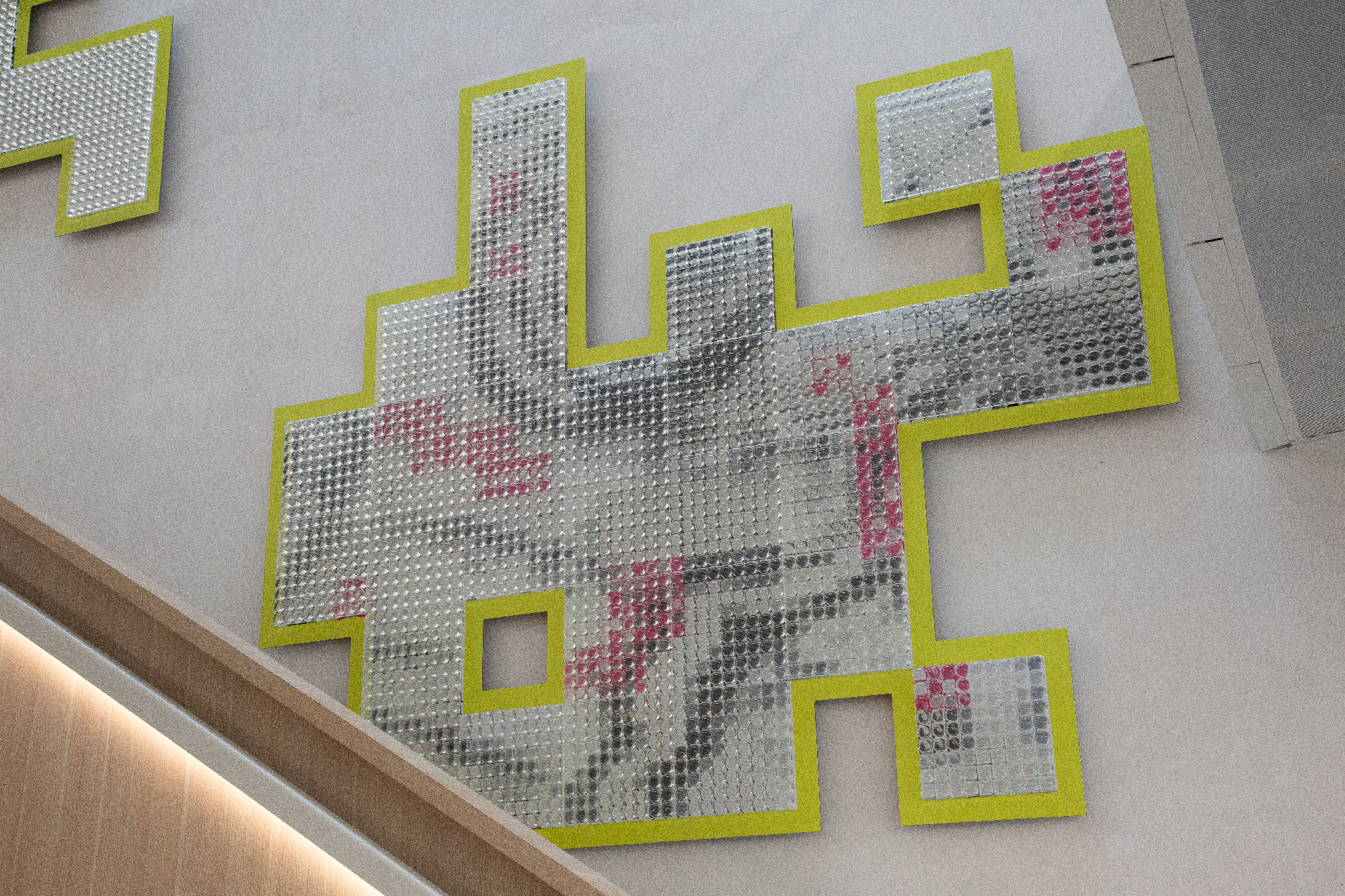
The result is a typeface that feels both timeless and urgent. Megafon is not designed for quiet reading at a desk. It is made for banners, posters, placards—for surfaces where voices need to be heard over noise, where words must carry force across distances. The letterforms are built for impact, their generous counters and sharp terminals ensuring legibility even from a distance or in motion.
But Megafon is more than a functional tool. It is also a meditation on the role of design in social movements. At a time when public space is increasingly contested, when voices are amplified or silenced by technology and power, the project asks what responsibility designers have to shape not just how we communicate, but what communication can be. Megafon proposes that typography can be a form of activism—that the letters themselves can carry meaning, can embody protest, can speak when we need them to.
Created at the Academy of Fine Arts and Design, Megafon represents a synthesis of Strahinja’s interests in graphic design, typography, and the social dimensions of visual communication. It is a project that looks outward, engaging with the world beyond the studio, asking how the tools we design can serve the voices that need to be heard.
In a world where megaphones are often used to drown out dissent, Megafon reclaims the symbol for expression, for gathering, for the collective voice. It is a typeface for those who have something to say—and for those who need to be heard.