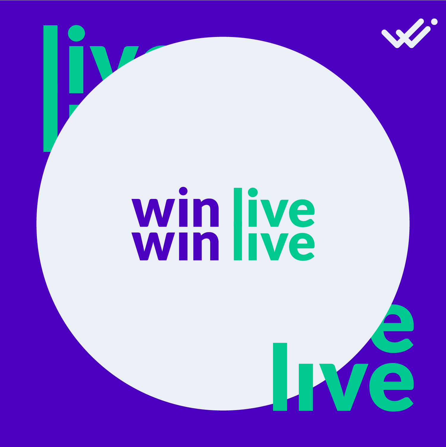
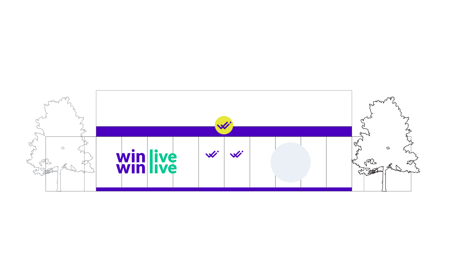
WinWin’s visual identity reflects its core philosophy of double-check, double-win. The system operates in two modes: static for website and official elements, dynamic for store communication. Together, they create a cohesive yet flexible brand language.

In its fluid form, WinWin’s identity takes shape as a butterfly—a symbol of transformation, growth, and the beauty of balanced outcomes. The dynamic logo moves, shifts, and adapts, mirroring the brand’s responsive, customer-centered approach.


%20ANIM%2027-01-2021%20(SJ)%209-min.gif)
%20ANIM%2027-01-2021%20(SJ)%208-min.gif)
%20ANIM%2027-01-2021%20(SJ)%202_1-min.gif)
%20ANIM%2027-01-2021%20(SJ)%203_1-min.gif)
%20ANIM%2027-01-2021%20(SJ)%204_1-min.gif)
%20ANIM%2027-01-2021%20(SJ)%207-min.gif)
The identity balances precision with playfulness. Static elements provide stability and trust for digital interfaces, while the fluid butterfly form brings warmth and energy to physical retail spaces—a dual approach that captures WinWin’s commitment to win-win relationships.


In 2022, Strahinja Jovanović undertook a comprehensive rebranding project for WinWin, a prominent Serbian retail and e-commerce company. The challenge was not merely to update a logo, but to create a visual identity that could embody the company’s core philosophy: the double-check, double-win methodology. The result is a sophisticated dual identity system that balances stability with fluidity, precision with warmth, and function with meaning.
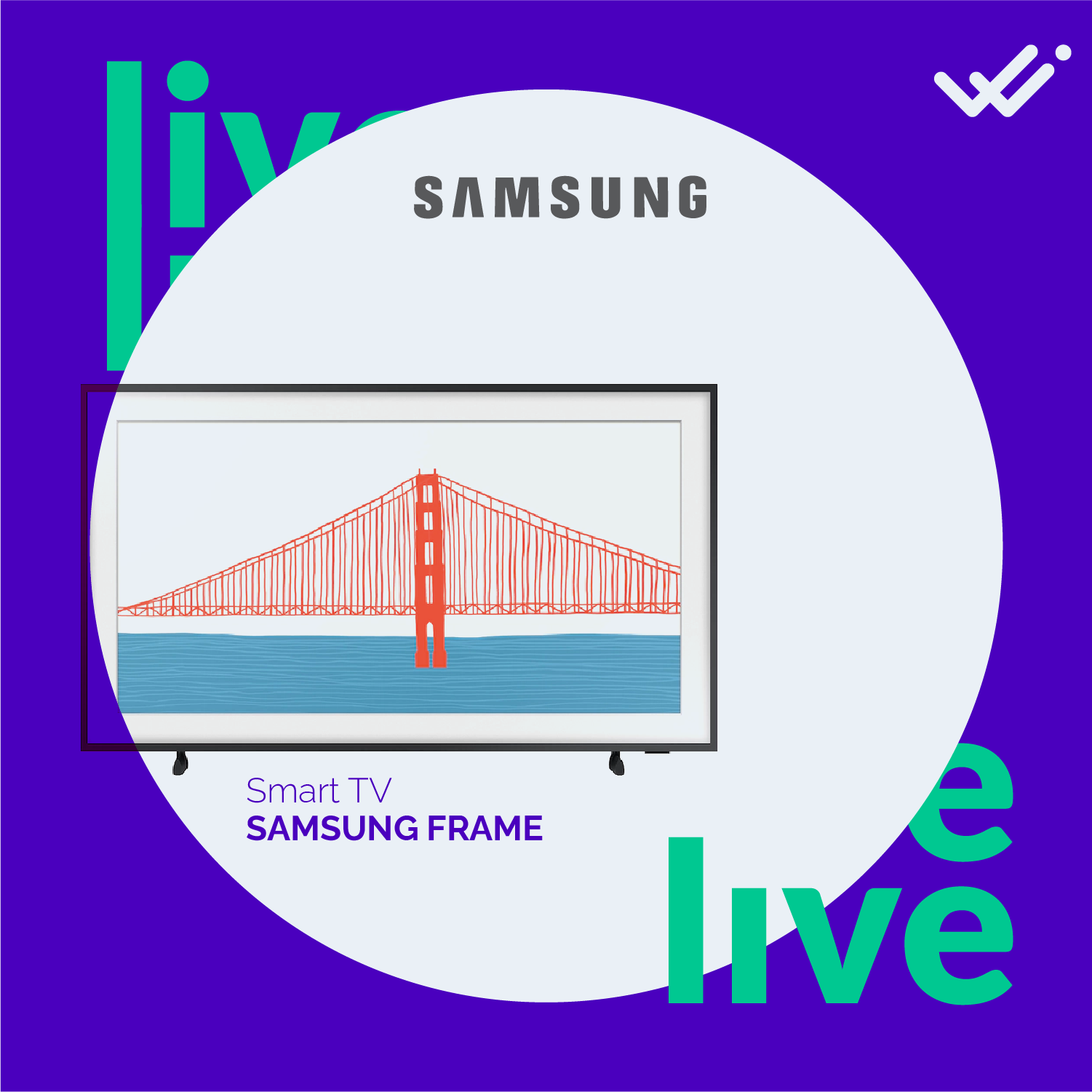
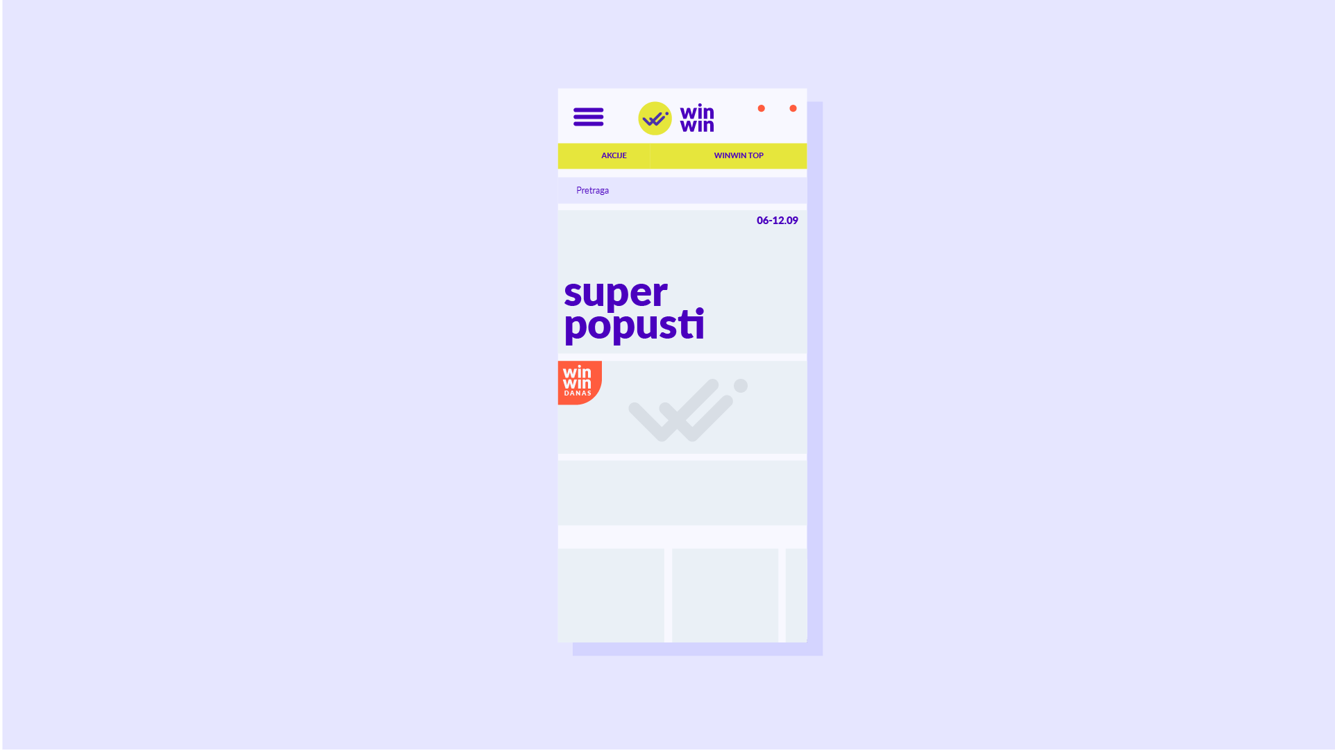
The identity operates in two distinct but interconnected modes. The static version is designed for all fixed applications—the website, official documentation, and digital interfaces where consistency and clarity are paramount. Here, the logo and typography are clean, confident, and unmistakably professional. Every element is carefully considered to build trust and convey reliability, essential qualities for an e-commerce platform handling transactions and customer data.
But the static identity is only half the story. In retail spaces and communications, WinWin transforms. Here, the brand reveals its fluid identity—a dynamic form that takes the shape of a butterfly. The butterfly is not a random choice; it is a carefully selected symbol that speaks to WinWin’s philosophy. Just as a butterfly undergoes transformation, WinWin helps facilitate positive change for its customers. Just as a butterfly moves gracefully between spaces, the brand moves between digital and physical realms, creating seamless experiences. And the butterfly’s symmetrical wings subtly echo the idea of “double”—double-check, double-win, dual benefits for both company and customer.
The fluid identity is dynamic by design. It shifts, morphs, and adapts across applications, bringing energy and warmth to physical retail environments. Where the static identity is precise and controlled, the fluid identity is organic and expressive. Together, they form a complete visual language that can function across the full spectrum of WinWin’s operations—from the clinical precision of a checkout interface to the inviting atmosphere of a storefront display.
This dual approach reflects a deep understanding of contemporary retail. WinWin operates at the intersection of digital and physical commerce. Its customers engage with the brand through screens and in person, sometimes switching between the two within a single transaction. A successful visual identity must be equally adaptable. The static system ensures consistency across digital touchpoints; the fluid system brings that same consistency to physical spaces, but in a form that feels appropriate to the context.
The butterfly motif also carries deeper cultural resonance. In Serbian and broader European contexts, butterflies are associated with positive transformation, good fortune, and the beauty of balanced outcomes—all values that align with WinWin’s mission. The identity transforms a simple business concept into a meaningful visual metaphor, giving customers something to connect with beyond the transactional.
For Strahinja, the WinWin project represented an opportunity to explore how identity systems can be both rigorous and poetic. The work is precise in its execution—every curve of the butterfly wing, every detail of the static logotype—but also generous in its meaning. It is a visual identity designed to grow with the company, to adapt to new contexts, and to communicate, across every touchpoint, what WinWin stands for: partnership, transformation, and the promise of double wins.
.gif)