Folium translates the Fibonacci sequence into letterforms. Inspired by leaves—their curves, their growth patterns, their organic proportions—the typeface embodies the mathematical beauty found throughout the natural world.

Each letter in Folium carries the logic of leaf morphology. Shapes emerge from organic curves, proportions follow natural arithmetic, and the grid echoes the structures found in plant life. Typography as biology.


Drawing on the Fibonacci sequence and the study of leaf forms, Folium creates a typeface where mathematics meets morphology. The result is a letterform system that feels both organic and precise, natural and designed.


In 2020, Strahinja Jovanović set out to create a typeface that would embody the mathematical principles underlying natural form. The result was Folium—a name derived from the Latin for leaf—a typographic exploration of the Fibonacci sequence, organic growth patterns, and the geometry of plant life.
The project began with observation. Strahinja studied leaves: their shapes, their curves, the way they unfurl from buds, the proportions that govern their expansion. Leaves are not random; they follow patterns that can be described mathematically. The Fibonacci sequence appears in the arrangement of leaves around a stem, in the spiral of a fern, in the veins that branch across a surface. Folium asks what would happen if these principles were applied to letterforms.
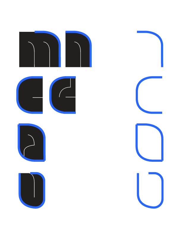
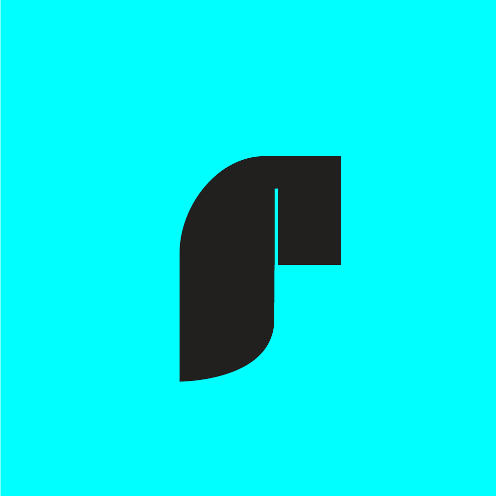
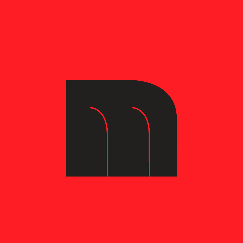
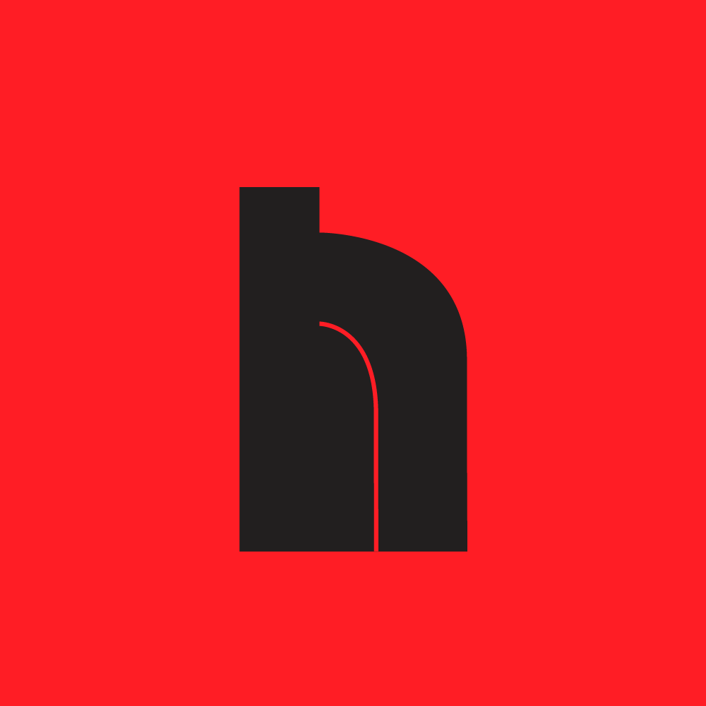
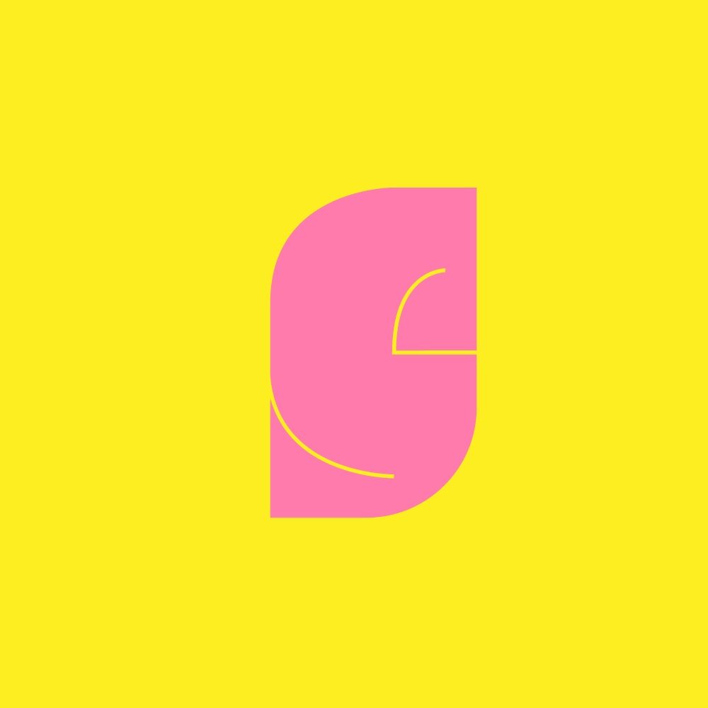
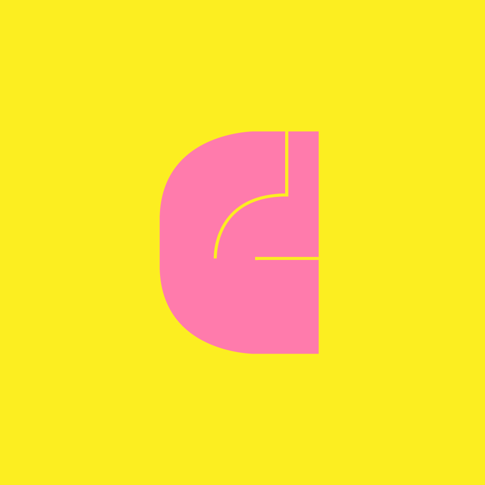
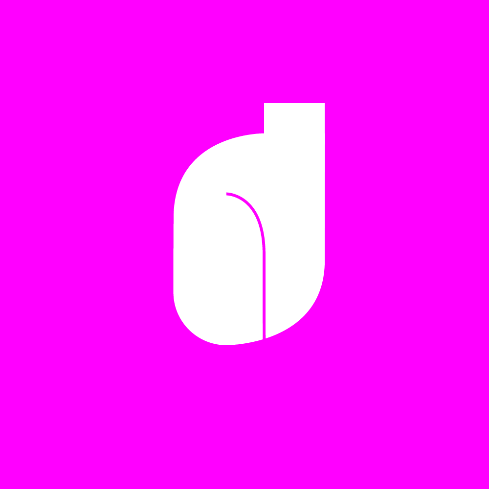
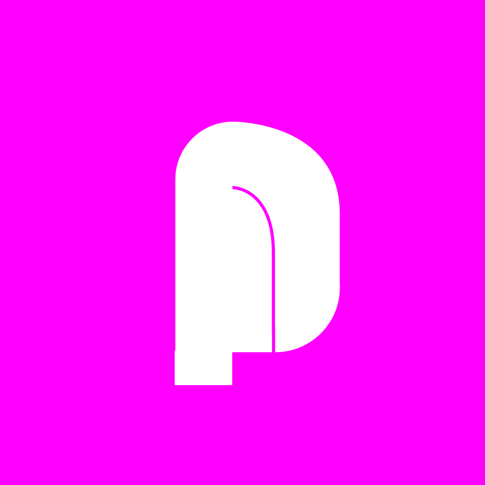
The typeface is built on a special grid, one that reflects the relationships found in leaf morphology. The proportions of the letters—the width of a stem, the curve of a bowl, the opening of a counter—are derived from natural arithmetic sequences. The thickness of the strokes varies according to patterns of growth and development. The lines that break down the letters echo the veins that structure a leaf. The result is a typeface that feels organic without being literal, mathematical without being mechanical.
The process was both analytical and intuitive. Strahinja worked with the Fibonacci sequence, applying its ratios to the construction of letters. He studied leaf specimens, tracing their contours, mapping their dimensions. He experimented with thickness, with line weight, with the relationships between positive and negative space. The typeface emerged from this dialogue between observation and construction, between the laws of nature and the conventions of typography.
Folium is not a display typeface; it is a text face, designed for reading. The organic influences are subtle, felt rather than seen. A reader may not recognize the Fibonacci ratios underlying the letter spacing, but will experience the rhythm they produce. The curves may not be consciously identified as leaf-like, but they carry a quality of naturalness, of ease, that distinguishes the typeface from more rigid geometric designs.
The project also reflects Strahinja's broader interests in the intersection of mathematics, nature, and design. Across his work, he has explored how systems—whether of ornament, type, or code—can generate forms that feel both structured and alive. Folium is a direct expression of this interest: a typeface built from the same principles that shape leaves, that govern growth, that structure the natural world.
The name Folium carries multiple meanings. It refers to the leaf that inspired the design, but also to the folio—the page—that the typeface will inhabit. It suggests a continuity between the natural and the textual, between the leaf and the leaf of paper, between the patterns of growth and the patterns of reading.
For Strahinja, the project was an opportunity to deepen his engagement with typography, to push beyond the conventions of letterform design into the territory of biology, mathematics, and philosophy. The result is a typeface that is not only functional but meaningful—a tool for reading that carries within it the logic of the natural world.
In the end, Folium is an argument for the connection between typography and nature. It suggests that letters, like leaves, can embody the principles of growth, proportion, and organic form. It is a typeface that asks us to read differently—to see in the shapes of letters the same patterns that shape the world around us.
%20ANIM%2027-01-2021%20(SJ)%201-min.gif)